Timbashield
The brief
Our team was approached by A-Chem – a Derbyshire-based manufacturer of chemicals, which are mainly used to make car care products. The company prides itself on producing quality materials.
Although, during the beginning of the Covid-19 lockdown they, like most businesses, were looking for ways to sustain & protect themselves. That’s when they found a unique opportunity to start selling woodcare products under the ‘Timbashield’ name on Amazon marketplace.
No one could’ve predicted the rapid growth and their woodcare products suddenly became bestsellers in their category on Amazon. With thousands of sales coming in – the stakeholders realised that they want to use this opportunity to the fullest.
And that’s when they reached out to us. They already had a good price, a good product, and good reviews – the last piece of the puzzle was building the Timbashield brand.
A-Chem leadership wanted to create a separate brand from the parent company. Selling woodcare products, as well as introducing a new range of exterior wood paint under the Timbashield banner.
Setting out on a mission ‘to offer wood care products that are inspired, accessible, high-quality, and fit-for-purpose.’
The solution
The end-product turned out to be more of a premium approach to your average woodcare brand. Put together around Timbashield’s core values: crafted, trusted, proud, dependable, refined, and modern.
We started the project by creating multiple variations of the brand and presenting them to the client. After some time, elements were picked out from our proposed ideas and put back together into one final brand.
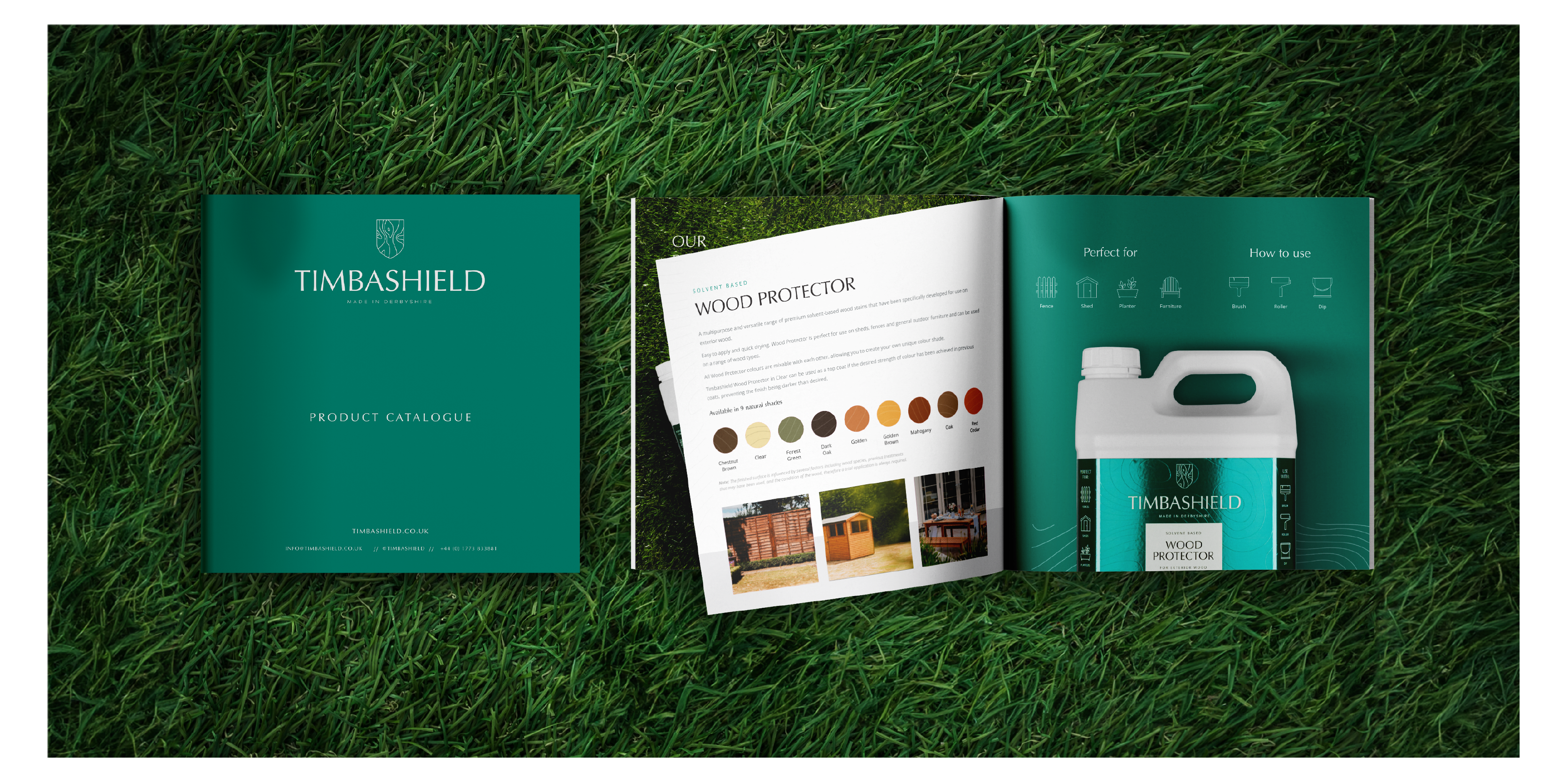
The core, aside from its values, became the shield device as well as the adaptable packaging system. Maintaining a nature-like colour palate and wood patterns all over.
Additionally, the client wanted to remain ‘proud’ of their heritage – thus the packaging is proudly representing ‘Made in Derbyshire’ as a tagline.
Services
The Shield Device
The ‘shield’ was a MUST to have as a brand element. After all, it’s part of the brand’s name. The shield, the name, and the tagline all came together into the final logo of Timbashield.
It was created to represent exactly what the brand does – protect the wood with their products. The logo is simple, elegant, and modern. Whilst reflecting the quality standard of the product range. The typeface chosen is a simple sans-serif font, but the varied thicknesses used throughout work well to create an elegant and crafted feel.
The wooden pattern on the shield, allowed us to translate the message that the products are made to care for wooden materials. The symbol of the shield itself – conveys a strong idea of protection. In combination with the wood patterns, the meaning stands as ‘protection of wood’.
Additionally, the shield device is not only used as a part of the logo but as a part of the packaging as well. Representing the colour and the type of product it is on. However, the shield on woodcare products varies a bit from the shield on paint packaging.
The Packaging System
The first challenge with the packaging system was – how do we make jerry cans’ (plastic bottles) packaging sexy? It may sound odd but creating attractive packaging for plain white plastic bottles is not that straightforward. Especially when the same design system is supposed to suit the metal paint tins as well.
The whole idea behind the packaging system we created was to make something scalable. Balancing functionality and design elements – we came up with a system that the client can scale on any packaging size. Whether it’s a 2L or 10L container. It was built on an ‘80:10:10’ ratio system, to maintain the visual style consistent.
Moreover, the wood pattern from the shield logomark was transcribed onto the packaging system as well. As well as maintaining the shield as the most attention-grabbing element.
Every shield on woodcare products will include (from top to bottom): product category, product type, application, colour window, colour name, and water beading.
Whilst every shield on paint tins will include (from top to bottom): colour range, colour, application, and colour window.
The packaging is accompanied by a range of icons we’ve created. They were made to fit and follow the Timbashield brand identity. Inspired by the lines of wood patterns, icons are always outlined and kept as close to a square format as possible. While remaining clean and easy to view on a small scale.


Marketing
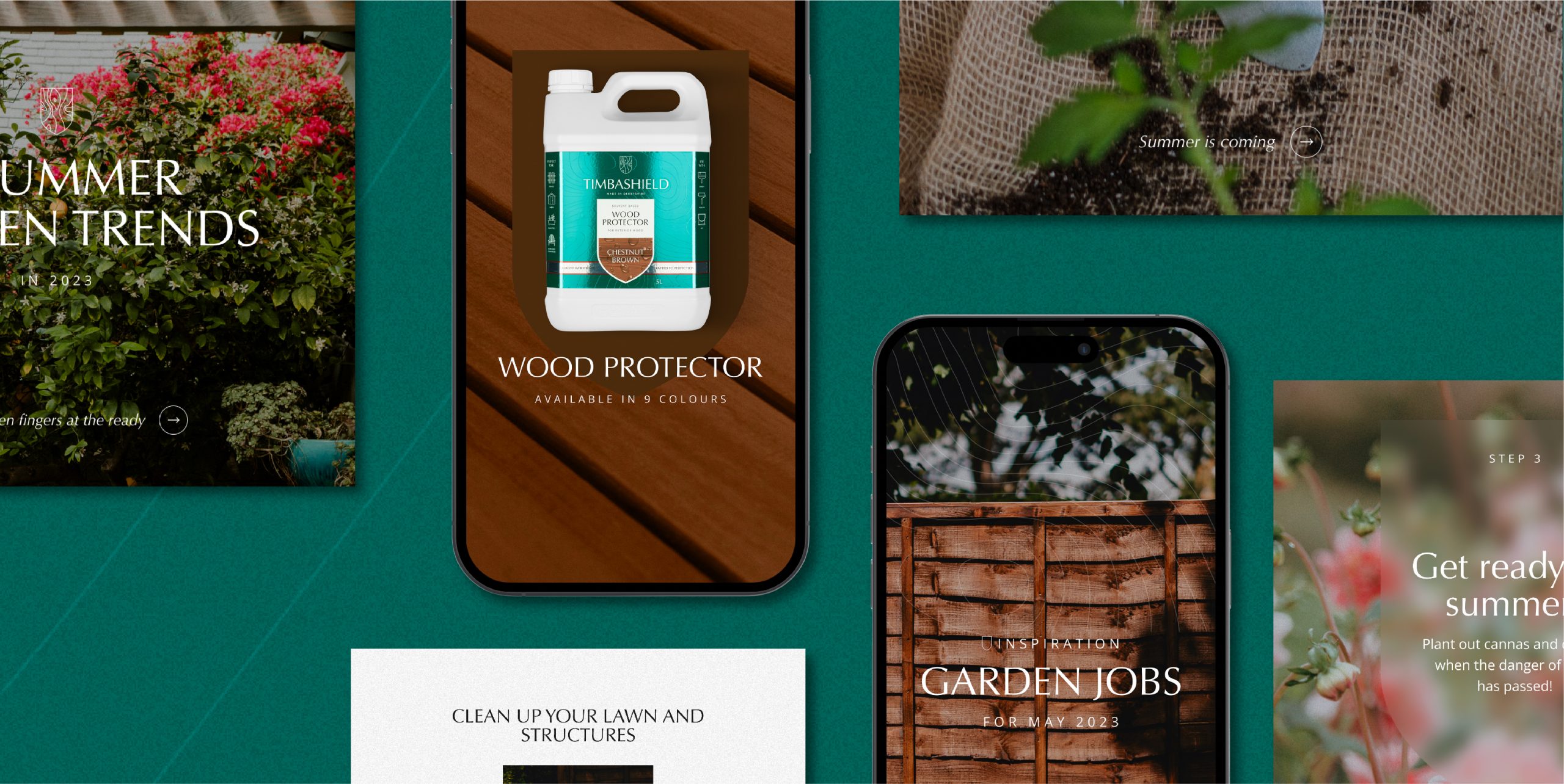
Our partnership with Timbashield began with a deep dive into crafting a marketing strategy and messaging framework that truly resonated with their team and brand vision. Once we had the foundation solidified, we took ownership of their digital presence, from social media management to website content and SEO.
With the brand identity and packaging system firmly established, we developed a holistic digital marketing strategy designed to drive growth and build lasting customer relationships.
We now manage Timbashield’s Shopify website, ensuring it stays true to their brand while delivering a seamless and engaging user experience for their customers.
In addition to website management, we oversee their social media presence across platforms like Facebook and Instagram. Our team consistently produces engaging content—ranging from product showcases and DIY tips to highlighting their Derbyshire roots—that has helped Timbashield connect with their audience on a personal level.
Our work extends into content marketing as well, through regular SEO-optimised blog posts and webpage content updates, helping Timbashield rank higher in search results while establishing authority in their niche.
We’ve also rolled out effective email marketing campaigns, creating another vital touchpoint for nurturing leads and retaining customers.
Through this fully integrated approach, we’ve been able to help Timbashield establish a stronger brand presence beyond their origins on Amazon. From increasing traffic to their Shopify store, to building a loyal customer base – Timbashield’s growth highlights the power of a cohesive digital marketing strategy.
