RSPCA’s New Brand: A Leap Forward for Animal Welfare?
17th Apr 2024

Written by Sami
In a historic move, the Royal Society for the Prevention of Cruelty to Animals (RSPCA) has unveiled a revamped brand identity, marking the first update in 50 years. The timing of this announcement couldn’t be more significant, as it coincides with the organisation’s 200th anniversary, symbolising a new chapter in its longstanding mission to protect and advocate for animals.
In this article, not only will we delve into the details of the RSPCA’s rebrand, but the think3 design team will also be sharing their thoughts and feelings about this monumental change.
Background
The RSPCA, founded two centuries ago, has been at the forefront of championing animal rights and welfare. As a non-profit organisation, its brand plays a crucial role in conveying its mission and values to the public. Over the years, branding has served as a powerful tool for communicating the organisation’s commitment to animal welfare and rallying support for its cause.
Analysis of the Rebrand
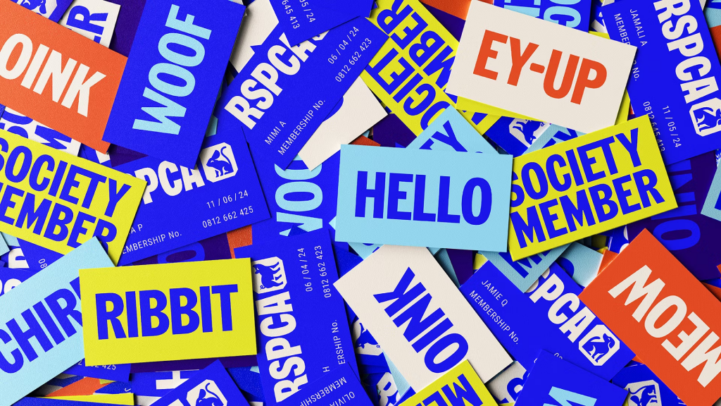
The recent rebranding initiative undertaken by the RSPCA represents a strategic effort to modernise its visual identity and align it with its evolving mission. The updated brand elements, including the logo, colour palette, and typography, reflect a more contemporary and inclusive approach. By shedding its old identity and embracing a fresh look, the RSPCA aims to better resonate with audiences and inspire collective action for animal welfare around the world.
Grant Thompson, Creative Director, and Co-Founder at think3 said, “As a charity, it is important to focus on the two areas of audiences – fundraising, and the actual work/service the organisation provides. I feel there is a balance and they have struck that well. As far as rebrands go, it has been modernised by colour, type, logo, motion, and application – making up the identity in a bright colour palette, flared sans serif custom wordmark, a fun tone of voice, and the nicest element within the rebrand, the nod to the old brand the ‘octagon’ shape which acts as a device throughout the identity, for housing illustrations, masks for photography etc.”
He added, “Whilst not all these elements work perfectly, as a collective it does create a sense of being identifiable, recognisable, and creating own ability which is super important for the RSCPA being a charity. Overall a much needed update to infuse RSCPA with a contemporary vibrant identity that will no doubt last for a long time to come.”
Sami Mohammad, Brand Designer at think3 joined the conversation and said, “Overall, I appreciate the direction in which the RSPCA is headed with its new look and feel. However, I have some reservations regarding the bold and bright aesthetic. While these choices undoubtedly catch the eye and make the brand stand out, I’m concerned they might inadvertently detract from the seriousness of the organisation’s mission. Animal welfare is a deeply serious and often distressing issue, and I feel that the bright modern look may not convey the appropriate tone. While it’s important for the brand to modernise, it’s equally crucial that it maintains a sense of gravity and sincerity in addressing the issues the RSPCA tackles.”
He added, “There are however some very strong and positive elements to the new look, such as its application of its previous logo. Incorporating the shape of the old logo into the new brand was a great idea. This approach not only preserves a part of the brand’s heritage but also seamlessly integrates it with the refreshed appearance, enabling the brand to maintain a connection to its roots while retaining a sense of familiarity as it moves forward.”

Sami also said, “The new style of illustrations is a strong addition to the brand, in my opinion, as it not only highlights the range of animals that the RSPCA deals with in a more creative and approachable way, but it also offers significant flexibility from a branding perspective. These illustrations have been utilised in various applications, such as uniforms and shops, giving each shop location its own animal which represents the animal associated with the location. I strongly feel they are a big improvement from the past generic animal illustrations used by the brand.”

Impact and Reception – Should Charities Spend Funds on Marketing?
Initial reactions to the rebrand have been mixed, with stakeholders expressing both praise and scepticism. Some individuals have raised concerns that the organisation’s new brand and mission signal a shift away from its traditional role as a charity toward a more activist-oriented approach. In this section, we’ll delve into the multifaceted debate surrounding whether charities should allocate resources to rebrands and marketing endeavours.
On one hand, some argue that resources dedicated to rebranding could be better utilised for direct animal care and support. Every penny spent on marketing are resources that could potentially provide food, shelter, or medical care for animals in need. This viewpoint emphasises the importance of prioritising the immediate needs of animals over branding efforts.
However, there’s another perspective to consider. Strategic branding and marketing play a vital role in raising awareness, maintaining relevance, and engaging supporters. By investing in rebrands and marketing initiatives, charities like the RSPCA can ensure that they remain at the forefront of people’s minds, driving support and donations to sustain their crucial work in animal welfare.
The recent rebranding efforts by the RSPCA provide a case in point. Despite concerns about resource allocation, the organisation’s decision to refresh its brand identity resulted in significant increases in organic search traffic and social media impressions. For instance, following the announcement, the RSPCA experienced a surge of 7,922 Google searches, indicating heightened public interest and engagement.
However, it’s essential to acknowledge that increased visibility doesn’t always equate to positive sentiment. Despite the significant social media impressions generated by the announcement—approximately 471,570 impressions—the sentiment score on platforms like X (Twitter) was relatively modest, at 65.76. This discrepancy highlights the complexity of managing public perception and underscores the importance of aligning branding efforts with organisational values and mission.
The RSPCA itself acknowledges that the rebranding goes beyond merely updating its logo; it aims to elevate the profile of animal welfare and inspire greater public engagement. According to the RSPCA, the new brand seeks to mobilise a broader movement for animal welfare, encouraging individuals to recognise their role in improving animals’ lives and fostering a collective effort toward that goal. By reaching out to new audiences and inspiring participation from previously untapped segments of society, the RSPCA hopes to amplify its impact and effect positive change for animals both now and in the future.
However, not everyone is supportive of this shift in focus. Critics, such as Mark Dolan, have voiced their scepticism, characterising the RSPCA’s messaging as indicative of an activist agenda rather than a charitable mission. Dolan’s comments on GB News reflect a broader sentiment among some individuals who perceive the RSPCA’s advocacy efforts as straying beyond the realm of traditional animal welfare and into more politically charged territory.
The contrasting perspectives underscore the complexities surrounding the RSPCA’s rebranding and its implications for the organisation’s identity and public perception. As the RSPCA navigates this transition, it faces the challenge of striking a balance between advancing its advocacy goals and maintaining its traditional role as a charitable institution dedicated to animal welfare.
Future Implications
Looking ahead, the rebrand holds promising effects on the RSPCA’s visibility, fundraising efforts, and public perception. By embracing a more dynamic and contemporary brand identity, the organisation positions itself for greater impact and relevance in an ever-changing landscape.
On the other hand, this rebranding decision could come at a cost. If the RSPCA does not strike a balance between investing in marketing initiatives and fulfilling their core mission, they could risk losing supporters.
Moving forward, strategic communication and engagement will be key to maximising the potential of the new brand identity.
Final Thoughts
In conclusion, the RSPCA’s rebrand signifies a pivotal moment in its history, marking a bold step towards a brighter future for animal welfare. As the organisation embarks on its next chapter, it remains dedicated to its core mission of protecting and advocating for animals. With its revitalised brand identity, the RSPCA stands poised to inspire compassion, drive change, and make a lasting difference in the lives of animals worldwide.
As we evaluate the impact of the RSPCA’s rebranding decision, it’s crucial to consider the delicate balance between investing in marketing initiatives and fulfilling the core mission of animal welfare. By examining both the tangible outcomes and intangible implications of branding efforts, we can gain valuable insights into the broader debate surrounding resource allocation in the non-profit sector.
Are you considering a rebrand and not sure where to start? Get in touch with team today to see how we can create a successful new identity!