How to choose the right font for your brand?
27th Aug 2020
Brand typography is one of the most important parts of your brand identity. It should never be overlooked or dismissed. No matter how good your brand visuals are, using the wrong form of type on them can really bring their effectiveness down and degrade your brand. You might not even realise it, but subconsciously, different typefaces trigger different emotions in your mind and send different messages across. Nowadays, with thousands of variations of typefaces, it’s never been as difficult choosing a font for your brand – that would suit your message perfectly.
With this being said, a lot of points should be considered when choosing a typeface.
- Does the type fit in with my brand visuals?
- Does the type align with my brand values?
- Is it the right type for my brand’s target audience?
- Is the type clear enough for people to read?
- Will the type work with the amount of content I have?
If you find a typeface that positively answers all these points then you have found yourself the holy grail.
However, it can be very hard to find the holy grail due to many reasons, not just laziness. The most popular reason is the budget. A good professional typeface and its licensing can get very expensive – smaller businesses can’t afford such costs.
Another popular reason is looking in the wrong places. There are plenty of websites with free fonts you can choose from, the likes of; fontsquirrel, 1001 fonts or dafont, which have huge databases to choose from. The drawback is most of these fonts (not all) aren’t made by experienced designers. This means that they often have certain defects or they lack in certain areas; letter detail, consistency, layout, height & width, kerning.
They all play a crucial role in making the typeface clean and easy to read. If they aren’t set up correctly, even the best typeface can become confusing and unappealing. Other reasons can include; the lack of resources, licensing restrictions, or the typeface already being used by a different company.
How can choosing the wrong font damage your brand?
Well, first off choosing the wrong type can make your branding look unappealing, unprofessional, and just generally tacky. Unless that’s the brand style you are going for, you really don’t want this when choosing fonts. If your typography looks tacky it can give your customers a reason not to trust your brand, seeing the design of your brand will reflect on the products and services you offer. And will make your customers think that your product will be just as tacky, even if that isn’t true.
Secondly, it can make your message hard to understand and read. Resulting in a confused and uninterested audience. If your messaging requires the viewer to put extra effort into reading and understanding it – the chances are your viewers will think it’s too much hassle to interact with your brand and think of it as more of a waste of time. Think of it this way, the longer it takes the viewer to digest the message, the shorter their attention span will get. And the shorter their attention span – the less likely they are to be interested in your brand.
Thirdly, if your type and messaging don’t support the values your brand stands for, it makes it look unreliable and untrustworthy. This is the last opinion you want a customer to have about your business. Simply put, if your brand identity stands for one thing but doesn’t support that claim through your messaging then your audience has no reason to believe it really does.
How to pick a correct typeface?
To help you understand what sort of type you should be using in your brand, here are the different styles of typefaces available and what they are naturally associated with.
Serif
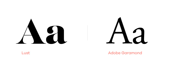
Serif typefaces are the oldest and most classic fonts out there. They have been used for hundreds of years and originated from the Latin alphabet with inscriptional lettering (words carved into stone in Roman antiquity). A “serif” is the small decorative flick at the end of a letter stroke. Serif fonts are classy and high-end but are also associated with tradition, history, and heritage.
They’re always a good choice for long-form texts, such as books, documents, or fine print. Because they are highly legible and thanks to the serifs – our eyes read the text much easier and quicker.
Sans Serif
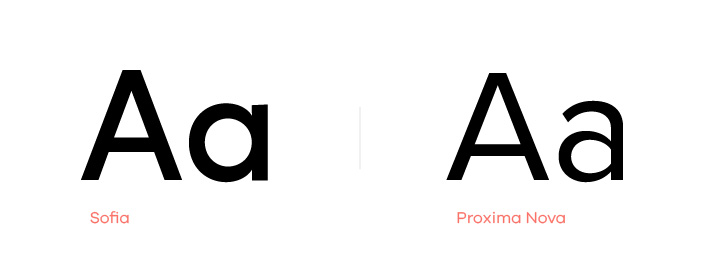
Sans is the French for ‘without’, so piecing this together Sans Serif basically means without serif. These typefaces simply don’t have decorative flicks at the end of each stroke of a character. They’re a much cleaner and simpler style of typography. Also, they work well for general readability and fine print. Sans Serif fonts are modern, simple, and clean – always bringing strength and clarity to designs.
These fonts often come in multiple weights which can in turn offer different tones in their messaging; thicker fonts are much more masculine and carry power behind them, whereas thinner fonts look more feminine and noble.
They have a great advantage of working well in lower resolutions due to their simplicity, making them the perfect go-to font for digital use, such as websites, apps, and e-books.
Slab Serif
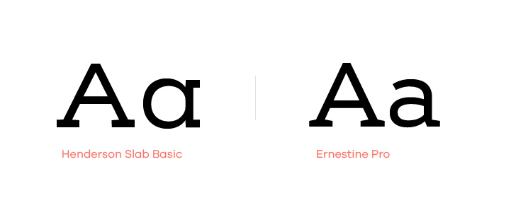
Slab fonts are a very old-school style of typefaces. They are characterised by their blocky thickness and even weight, in both the character strokes and serifs. Essentially, the Slab Serifs are not as elegant as normal Serifs and don’t have that flick feel. Instead, the serif is an even weight just like the rest of the letter. Slab Serif typefaces were mainly used on old typewriters, hence why they have an old-school and nerdy charm to them.
This style of typeface isn’t as popular anymore so it’s not seen that often. However, they work really well in logos and headers. Although they are still easy on the eye, they don’t work as well with large amounts of text.
Script
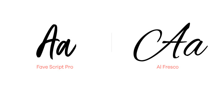
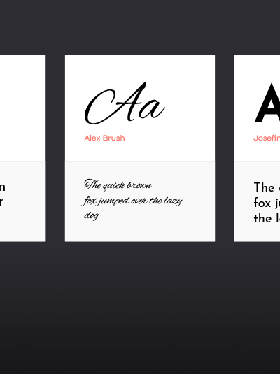
Script fonts are very unique and intuitive – their main characteristic is that they look handwritten. The popularity and availability of script fonts have majorly increased in recent years. As businesses are looking for more unique and personal ways to represent their brands.
There is a wide variety of different and unique script fonts available. Their styles can range from highly calligraphic and rich (something you would find on wedding invitations), to more simple and down to earth styles (often used on websites and blogs to mimic handwriting). Script fonts are associated with craft, personality, and uniqueness. They work well in rustic themed brands, but can also carry some femininity in them, making them well suited for brands such as beauty salons.
Script typefaces are decorative and therefore not suitable for long paragraphs, they would be very hard and eye-straining to read in large quantities. They can be used in logos and headings, but extra care needs to be taken when pairing with other fonts to ensure suitability as it’s very easy to mismatch a script font.
Decorative
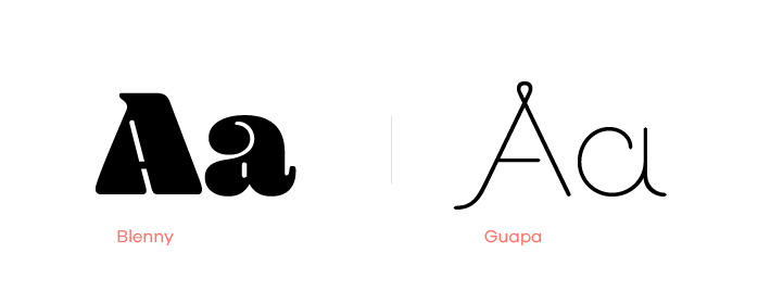
Decorative fonts are highly stylised fonts and as the name suggests, they are used for decoration. This means that the typeface is used to evoke certain emotions or thoughts in the viewer. However, you should always be careful when using decorative fonts simply because there are a lot of very bad ones out there.
The reason they’re bad is that they often lack the full spectrum of characters, this means that symbols such as ‘!’ and ‘?’ might be missing. They’re also often designed for a specific job, meaning that they will work for that specific job, but not necessarily on something different. Don’t completely avoid this style of font as there is always that odd good one out there.
Although it’s hard to state what characteristics decorative fonts have since they can vary majorly from one another in style – they all share the same value of originality & personality.
Decorative fonts are never a good choice for secondary fonts or long paragraph text. They can be used on headings and logos but again – you should be careful with them! Ensure the typeface contains all of the characters before you use it in your brand, as this may backfire in the long run.
Fonts to avoid
Trendy typefaces are not always a good idea. Trends constantly change, and something that is trendy now will most likely not be trendy in a year’s time. This means that in order to keep your brand up to date you will need constant rebrands. But if you avoid the current trends and instead focus on building your brand based on your brand values, you can really create a timeless brand identity.
Always try picking a font that will be compatible with whatever media & content you’re utilising. If most of your content is online then focus on fonts that work effectively online, if most of your content is printed – then focus on fonts that are legible and clear when printed in multiple sizes. Never go for a typeface just because you like the look of it.
When picking your font, check how big its family is. What is meant by that, is how many different variations of weights it comes in, does it come in a ‘Bold’ and ‘Italic’ version? The bigger the family the better the typeface for your brand identity. The wider variations of a single typeface will give your brand much more flexibility in your visuals and messaging, while still sticking to your brand style and maintaining the brand identity.
Final thoughts
Hopefully, this blog helped you understand typography a bit more and explained why choosing the right typeface for your brand is important. Choosing the right type for your brand, along with many other elements of brand identity that can be found in our article ‘Branding vs Logo‘ are what ultimately create a connection, positive or negative with your customers.
Always remember to pick type based not only on their look, but based on their usability and flexibility, and on what sort of message they make your brand say. Double-check that they will work well throughout all necessary forms of media. If you are not confident you will make the right choice, or you simply don’t know where to look, you can always seek help from professionals.
Our designers at think3 have experience in building meaningful brands, and can always advise you on your brand identity and brand strategy.


