Ways to improve website accessibility in 2022 (updated)
22nd Dec 2020

The internet is a big and wonderful place. It is a platform for social networking, gathering information and entertaining. Much like other walks of life, web trends are constantly evolving. Different visual styles become popular and most importantly, web technologies improve. However, ensuring your website’s accessibility will always be important.
While many aspects of web design come and go like fashion trends, accessibility will always remain a vital part of a well-designed website. Everybody’s web experience matters. With more than 2 billion of the world’s population being disabled, having an accessible website is imperative.
Following on from my last blog, Accessibility Tips for Modern Websites, I am going to discuss what makes a website accessible, and what you can do on your own website to help accommodate those with disabilities.
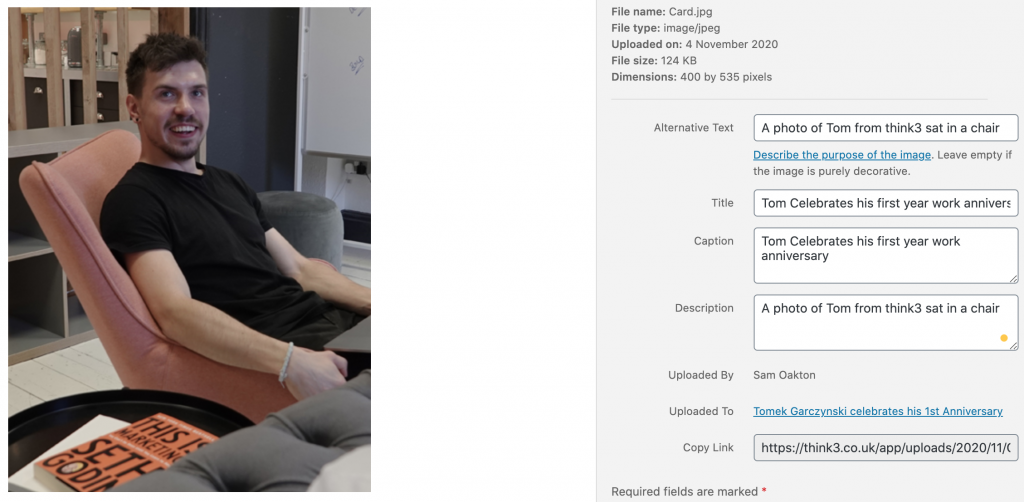
Adding alt text to your images
People with visual impairments may be using a screen reader when browsing the internet. Screen readers interpret a website and read out its content to the user. To ensure that users with screen readers understand the content of an image, you can add an ‘alt’ tag. These provide a text alternative for cases where an image is not displayed. When browsing your website, the screen reader will read out alt tags to the user, ensuring they understand the context.

Did you know, that adding alt text to your images also boosts your website’s SEO ranking?
Using appropriate font sizes
There’s nothing worse than struggling to read the small print, and it’s even worse if you’re visually impaired. This is no different for websites! The small text might look pretty in some scenarios, but it shouldn’t be used at the expense of readability. Make your text appropriately sized to ensure that everybody can read what you have to say.
Ensuring that your web page has a high readability score also improves your user experience.
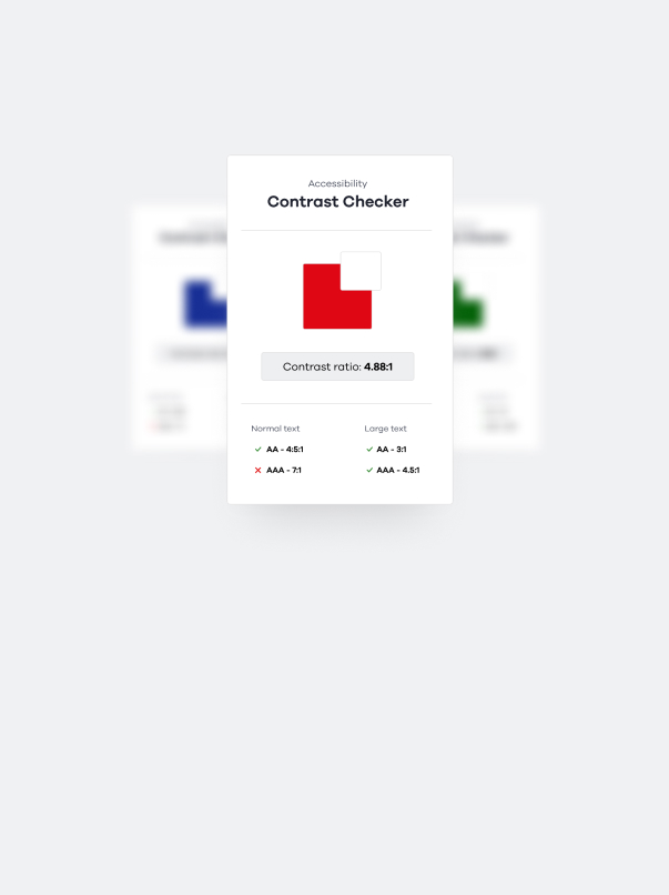
Use appropriate contrast when using colours
When you choose colours for your typography and background, it is important that there is a contrast large enough between them. If the colours are too close in lightness or darkness, those who are visually impaired may struggle to discern the text from the background. If you wish to deviate from the norm (i.e. not white-on-black or vice versa), ensure that the colours are different enough in brightness. Doing so will help those with dyslexia and other disabilities which affect reading.

Supporting keyboard navigation
An aspect of accessibility that can get overlooked is Keyboard accessibility. Some internet users may have motor disabilities or issues with dexterity, which means they cannot navigate using a mouse as effectively as the average internet user.
Keyboard navigation ensures those with motor disabilities can browse your website easily, without having to worry about accidentally clicking on the wrong thing.
Make your website accessible by keyboard, simply by ensuring that there is an outline around focused elements. This alone means that users that browse with a keyboard can see what they are currently focused on. It is important to avoid removing this outline unless you are replacing it with a different visual indicator.

Using ARIA attributes
Your website may have interactive elements which a screen reader could struggle to interpret. Using ARIA attributes can help with this issue. ARIA stands for Accessible Rich Internet Applications. ARIA describes the practice of ensuring your internet applications and interactive websites provide support for screen readers.
If your site has navigation links, for example, a screen reader will simply read these as links to other pages. However, ARIA attributes can provide context to the user. Adding ‘role=”navigation”’ to these links would tell screen readers that these links are used for navigating the site. This gives the user a better understanding of what they are.
Improve user experience and SEO rating by making sure your website links aren’t broken.
Using descriptive URLs
When adding links on your site, descriptive URLs will give users that use a screen reader a better idea of where the link will take them. We generally use visual cues and layout to provide this context to the user, but this is something a user with a screen reader will naturally lack. Giving them this context in other ways is vital for accessibility, and using descriptive URLs where possible is one of the best ways of doing it.
https://think3.co.uk/blog/simple-ways-to-make-your-website-more-accessible-in-2021
Find out how to use effective, descriptive keywords in your URLs, here.
Using appropriate padding between elements
Not only is using appropriate padding on your site good for aesthetics, but it also bodes well for accessibility. Content that’s too condensed together on the screen can be unreadable for those with visual impairments. Ensuring that there is enough padding between elements ensures that there is a visual indication of breaks in content. Padding helps content to be better digested, especially by those with disabilities.
Ensure your site is W3C compliant
There is no better way to ensure your website is accessible than marking it up against the W3C’s accessibility standards. Often initialised as WAI, it provides a good benchmark to measure your website’s accessibility against.
The WAI provides a set of technical methods you can use to improve your website’s accessibility, including:
- ARIA attributes (as mentioned previously).
- Accessibility on desktop and mobile devices.
- The Web Content Accessibility Guidelines include rules for your web content.
These resources are invaluable for web accessibility, and following them can take your website’s accessibility to the next level.
Follow the government’s website accessibility guidelines
The government states that “Accessible websites usually work better for everyone. They are often faster, easier to use and appear higher in search engine rankings.”
The UK government has its own set of guidelines on web accessibility that all government websites must follow. These may act as a good set of guidelines to follow for your own site.
think3 can make your website more accessible!
There’s a lot to take into consideration when it comes to accessibility. This means it’s easy to miss the mark when building your website with accessibility in mind.
Our web designers can build you a website with accessibility in mind, and we can also maintain your current site.
Here at think3, we provide a free accessibility audit. This will give you a better understanding of what you can do to improve your web accessibility and visibility on search engines. Along with this, we will also provide some advanced recommendations which can boost your website’s accessibility even further.
Be sure to get in touch with us and we will help you out!


