Guide to CMYK and RGB for Print and Digital design
11th Dec 2020

Written by think3
Understanding colour is important for both designers and clients, and this guide about CMYK and RGB in print and digital design aims to give you the basic knowledge you need to ensure you use the correct colours in the correct places. If you’re also interested about colour and its meaning then check out our Colour Psychology Blog!
Ever get that problem when you’ve created something spectacular on your computer and when you finally print it out, the colours are completely different to what you saw on screen? Yeah, we all hate that, and it can be one of the most frustrating things when you don’t know how to fix it.
Fortunately for you, you’ve just happened to come across the right blog to help you with such a problem. I will not only outline what causes these differences but also how you can avoid/fix them. I will also talk about the different colour profiles such as CMYK and RGB and how they are both used for print and digital design.
Let’s start at the basics
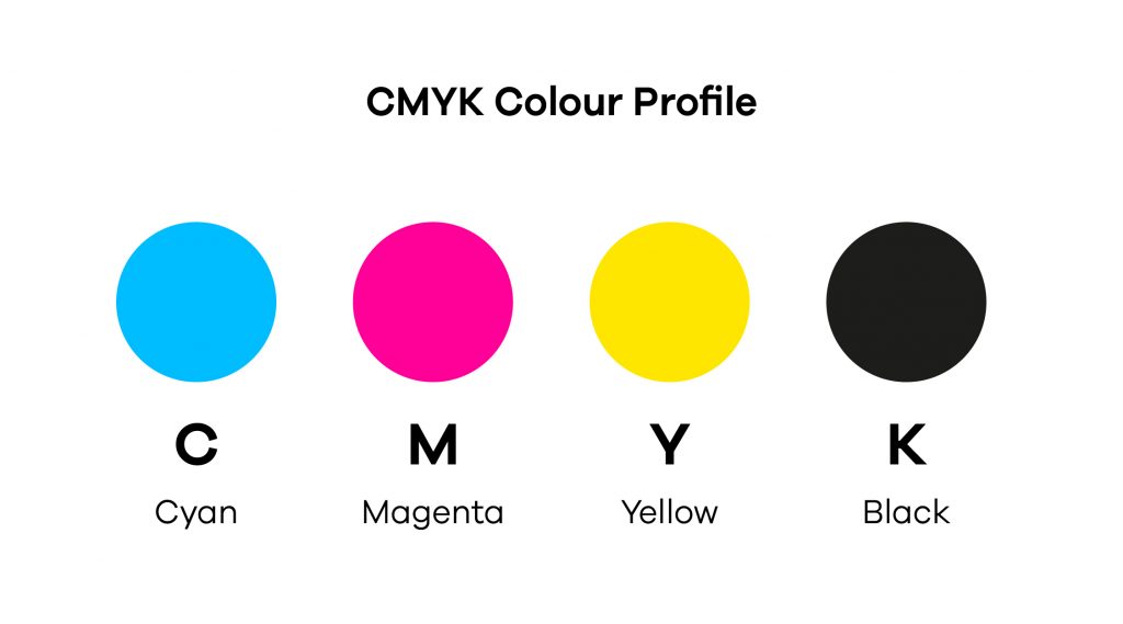
What is CMYK?
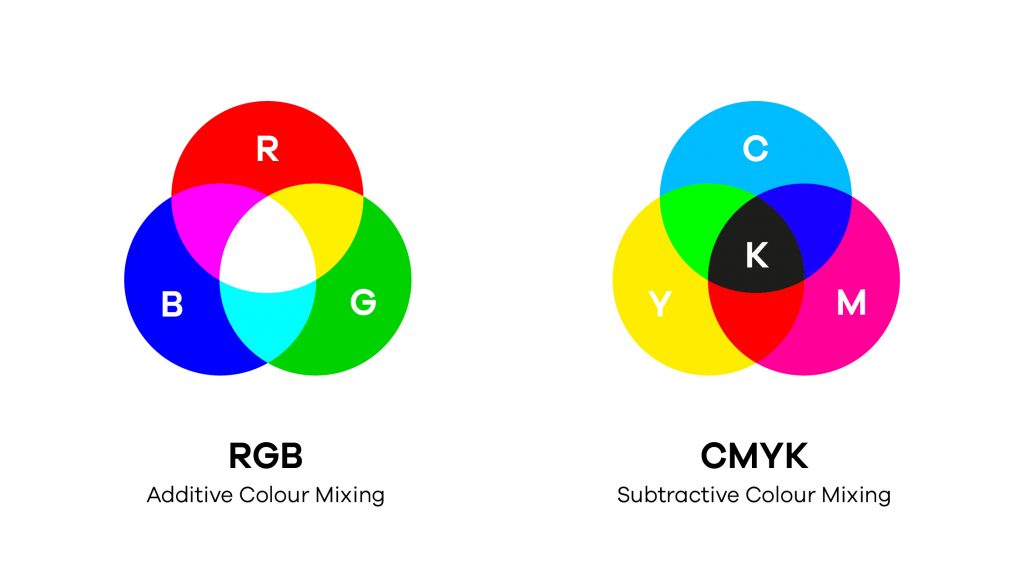
CMYK stands for Cyan Magenta Yellow and Black, the colours used in any printing process and the official colour profile of print and packaging. A printing press, such as a printer, uses dots of ink to make up the printed image out of these four colours.
Now the first thing you might ask is “why is Black represented by ‘K’ and not ‘B’?” Simply put, the ‘K’ stands for ‘Key’ meaning ‘Key Colour’. It’s called Key because its the main colour used to determine the image outcome, the black ink provides depth and shading while the other colours create different colours on the spectrum by being mixed together, for example, in order to get the colour green the printer would first print a layer of cyan and then again a layer of yellow over it, creating a green.
When to use CMYK?
CMYK should be used for any project that will physically be printed out, and not viewed on screen. This is because CMYK are the exact colours used by a printer so when your computer finally sends the request to print something out, it sends it in a colour profile that is much easier for the printer to understand, therefore giving you a much more accurate result of the print.
Examples of when to use CMYK:
Branding – Business cards, Business stationary, stickers, signs & storefronts
Advertising – Billboard, posters, flyers. Vehicle wraps, brochures
Merchandise – t-shirts, hats and other branded clothing, promotional products, pens, mugs etc.
Essential Materials – Product packaging, restaurant menus
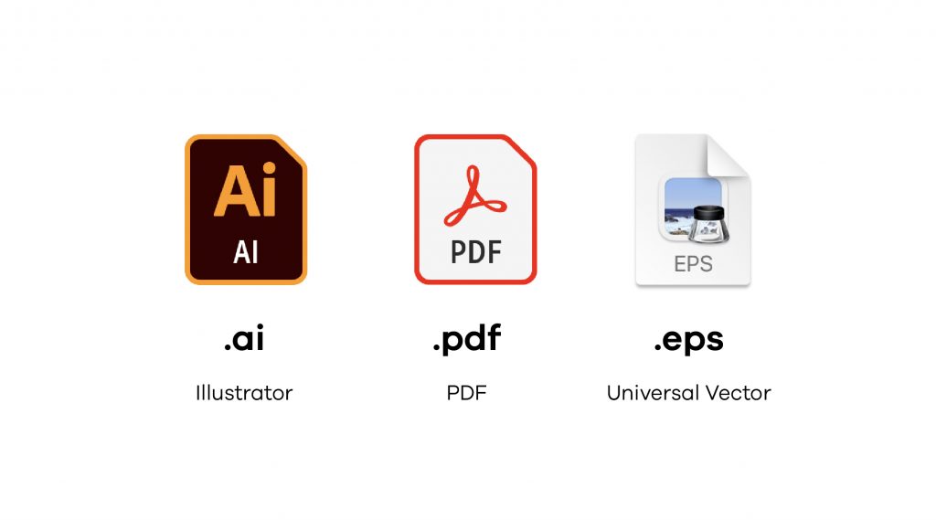
What file formats are best for CMYK?
PDFs (.pdf) are perfect for CMYK files simply because PDFs are compatible with pretty much any program. Illustrator (.Ai) is also the standard source file for CMYK. EPS (.eps) can, however, be a good alternative to Ai because it’s compatible with multiple other vector programs.
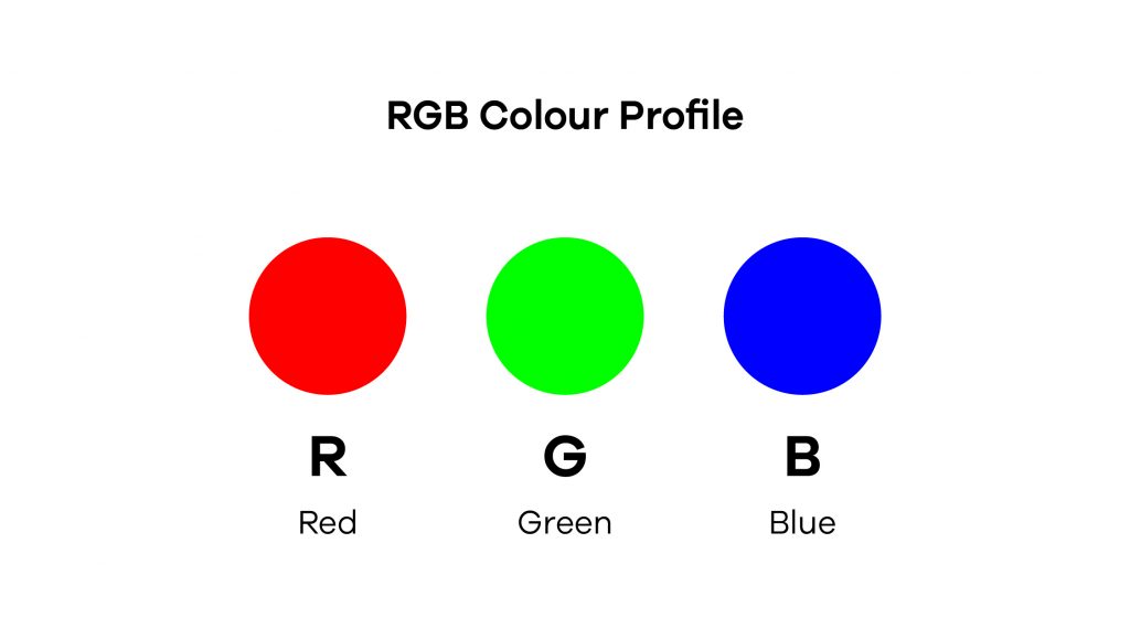
What is RGB
RGB stands for Red, Green and Blue, the colours used in digital displays to display colour. It’s used across all electronic devices such as Screens, Laptops, Mobile Phones, Tablets and TV’s. It is basically the official colour profile for any digital content. The colour is created through the light source in a device (such as the display) by adding together red, green and blue and then varying their intensity. The colour begins as black and then red, green and blue light is added on top of each other to brighten it and create the perfect pigment. When all the colours are mixed together at equal intensity, they create a pure white colour.
When to use RGB?
Use RGB for projects that will be viewed on a digital screen. This would go for anything that involves TVs, computers, smartphones, tablets, cameras etc. This is because the RGB colour profile is the profile that digital displays understand the most, therefore creating the most accurate results.
Examples of when to use RGB
Web & App Design – Icons, Buttons, Graphics,
Branding – Online Logos, Online Ads,
Social Media – Post images, Profile pictures, Profile backgrounds
Visual Content – Video, Digital Graphics, Infographics, Photographs for websites, social media or apps.
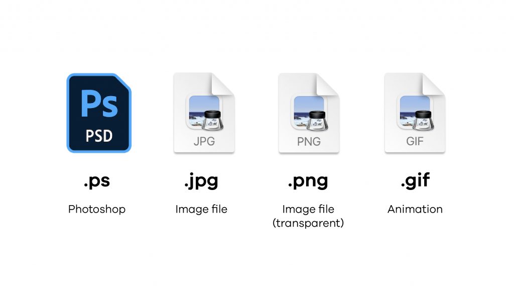
What file formats are best for RGB?
JPEGs (.jpg) are a great fit for RGB files because they have a good balance between the file size and quality. JPEGs are also compatible pretty much everywhere. PNGs are another good fit for RGB mainly because they support transparency, making them a perfect choice for graphics that need to be placed on top of other components such as coloured backgrounds or other images. GIFs allow animation, so if your graphic has motion in it, for example, a moving logo or a bouncing icon, then a GIF would be the ideal fit. PSDs are generally the standard source file for RGB documents.
What is the difference between RGB and CMYK
So the main difference between RGB and CMYK is their end outcome. CMYK is used for printing and creating anything that’s physically real, whereas RGB is used for digital and anything that’s is viewed online. By using the correct colour profile you achieve more accurate colours in your finished product, for example, by using CMYK you’re ensuring that the printed version is the same or at least very close in colour to the designs. And again, by using RGB you ensure that the colours you used in your designs are the same as the ones displayed on the finished product.
Another, more technical difference, is the way the colours work. CMYK uses ‘subtractive mixing’, meaning that all the colours start as a blank white and each layer of ink reduces the brightness of the white until the preferred colour is reached. RGB on the other hand uses ‘additive mixing’ which basically works the other direction. All colours start off as black and then red, green and blue are added on top of each other to lighten the colour and achieve the preferred colour.
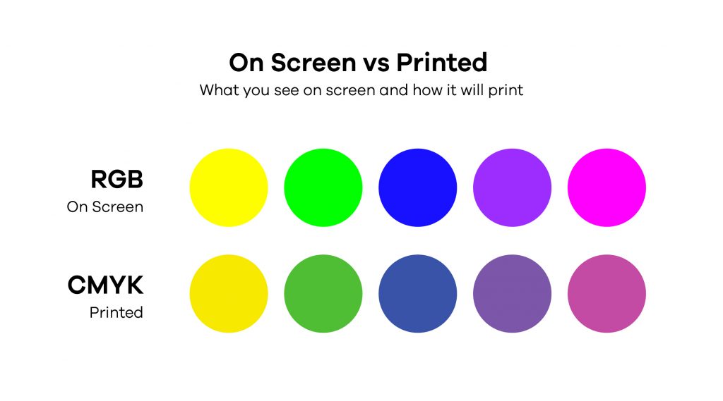
Why do colours look different on screen vs when printed?
So by now you are probably starting to gather the answer to this question. The colours look different simply because they are of two different colour profiles and so this not only means that they use different processes to create the colour, but also due to the process a different range of colours is achievable. For example, RGB uses the additive colour process, which allows it to create much more vibrant and bright colours than CMYK can. This means that if you’ve used a colour not in the CMYK range for printing, the same colour might not be printed. Instead, the computer or printer will try and match the colour to the closest colour in the CMYK range, and most of the time the colour turns out much duller than on the screen.
Think of it this way, monitors make colour with light, where the light can be of any intensity. Ink is made out of solid objects like rocks which are ground up and mixed with a medium, like oil. You spread ink on a paper to create the colour and since paper hasn’t got the light behind it, it’ll never be as bright as a screen.
How can I convert RGB to CMYK without loosing colour?
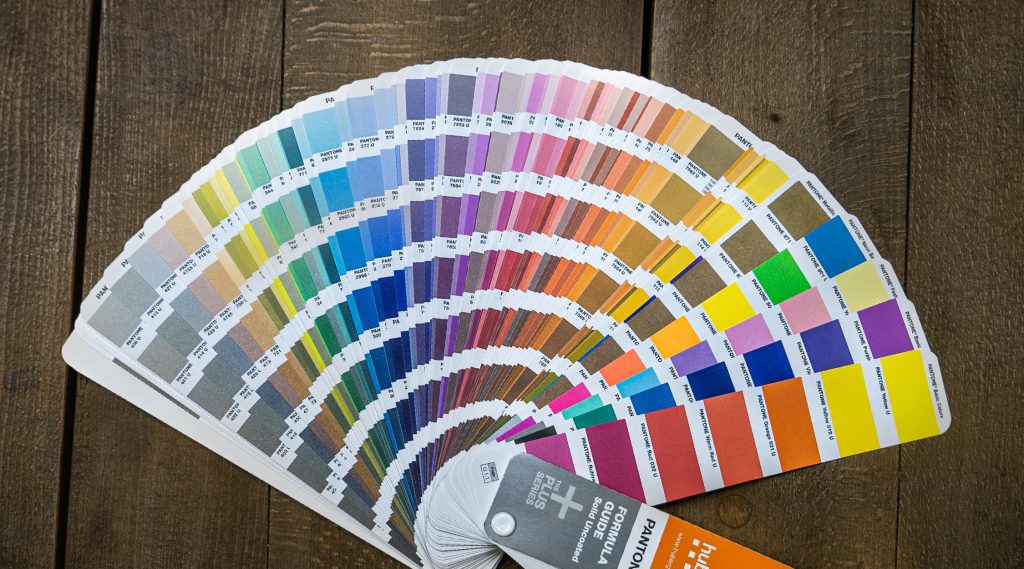
The short and simple answer is you can’t. CMYK has a limited amount of colours that it can print meaning that there are colours in the RGB range that are not in the CMYK. The most difficult colours to print are bright colours, especially bright reds. However, the best way to avoid differently printed colours is through the use of Pantone Colours, a must know tool in Graphic Design.
Invented in the early 60s, the Pantone Matching System is a tool that allows designers to colour-match specific colours regardless of the process used to create the colour. In basic terms, Pantone colours are colours that are the same on screen and printed. Each colour in the Pantone has its own unique number which allows for an exact match for every colour. This allows brands to maintain an exact brand colour that matches perfectly across all their applications, from website and digital content to print & packaging and stationary.
Why is print material still important in a digital world?
Although we had a massive digital push in the recent years which is basically becoming the new standard, it is still important to maintain an active and quality tangible marketing approach. This is because tangible marketing not only reaches a different audience, but it also reaches the audience in a different way.
The one big advantage of printed material is that it can be applied in a much wider area, for example, building billboards, bus stop posters, newspaper ads or hand out flyers. Unlike digital content, which can only be viewed on an electronic device like a laptop or a mobile phone, print media is much more accessible to the general public by being in the real world and getting noticed by anyone passing by your printed ad. The advantage of it is that your ad is seen by a much wider audience (basically anyone walking on the street) and has the ability to connect with consumers from different areas, instead of being just exposed to an audience who visits a specific website.
Another great advantage, is that it activates more senses in the viewer. You can only see and read a digital ad and maybe interact with it by clicking it. But a printed brochure can not only be seen and read, but also felt by being picked up and smelled (as weird as this sounds), this within the viewer activates more senses creating a much stronger experience and brand image in the viewers memory.
However, the quality of the printed material also reflects your brand so its important to maintain the highest quality possible throughout. A premium quality brochure will reflect the high standard of your brand, making your brand look premium and desirable and will make the viewer more inclined to actually view the print. A poor quality brochure will not impress the viewer and won’t convince them to view it, cheapening your brand image. But high quality does not only mean high quality finish, it also includes a good eye-inviting design with correct colour use and on brand visuals.
According to research, Colours are the number one influencing factor in purchases for almost 93% of people. This doesn’t necessarily mean that you need to use a specific colour for certain actions, instead it means using colour correctly, picking a palette that works well together and not overloading your design with colours to a point where its hard to look at and read.
Hopefully this post gave you a better understanding of CMYK and RGB colour profiles and why its important to know the difference between them, especially in Graphic Design. Now when it comes to your next project you can identify what colour profile you should work in and select it right from the start, avoiding unnecessary problems later on in your printing stages. If you enjoyed reading about colour then feel free to check out our other blog post about Colour Psychology, alternatively if you want to find out more about branding in general then check out our Branding vs Logo blog.
If you have any questions about colour or projects you’d like to work on then get in touch! We can create beautiful, bespoke marketing material for you or your brand. From digital content to print and packaging, think3 are experts in combining brand driven messaging and eye-catching design. Just have a look at our portfolio to see for yourself!