Marketing Derby
City on the up
The brief
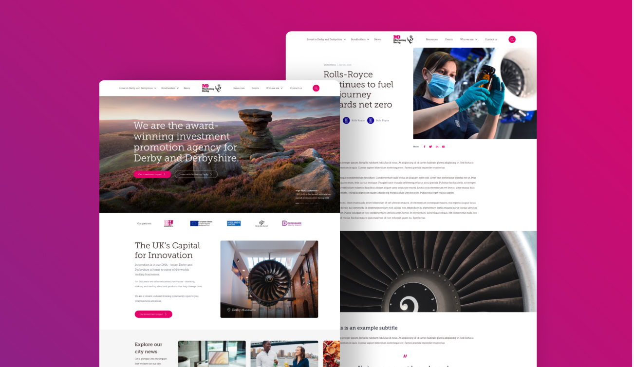
Marketing Derby is an investment and promotion agency with the goal of promoting derby as ‘the place to be’. They put out a tender for development of their new website last year – we ended up being hired for it.
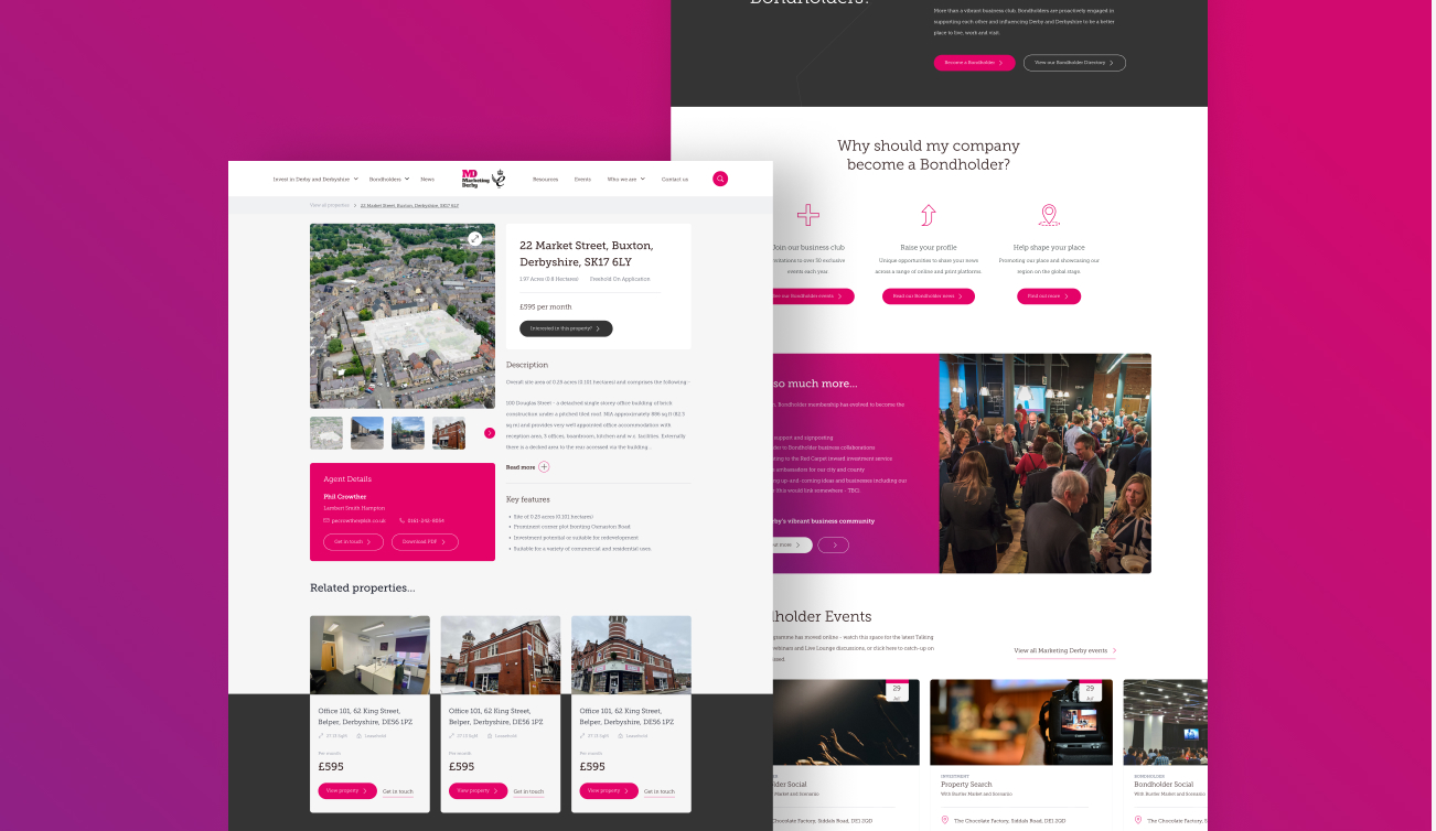
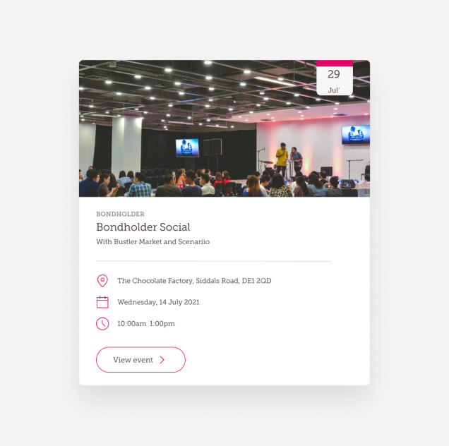
The core sides of the business, they wanted to be reflected on the website were attracting investments and continuing working with bondholders as a largest networking club in Derby.
They wanted for a bespoke website to be built from scratch, with a thought-through user experience. To make the process of discovering investment & bondholder opportunities as straight forward as possible.
The solution
Once we had understood what the client was expecting from the brand-new website, we started developing sitemap and content plan, which eventually turned into a high-fidelity wireframe.
In its essence, high-fidelity wireframe is a stripped back version of what the website will be and it’s a functioning prototype that allows the client to explore the site. It helps all parties understand the layout and the structure of the website, before developing & designing the site. Making the development & design process more efficient.
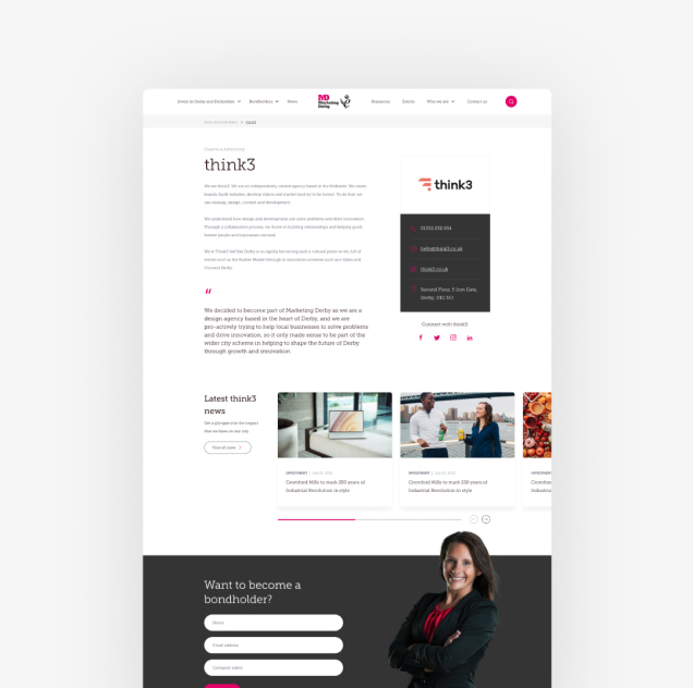
We wanted to focus on creating a bespoke website that is easy to navigate and find information on. So, not only did we create various search pages, to organise data, but also automated the process of updating property pages with an automated API.
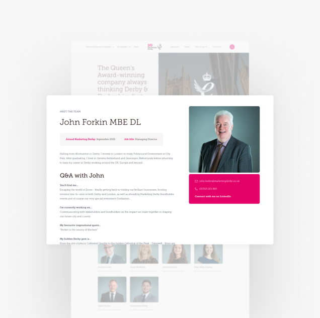
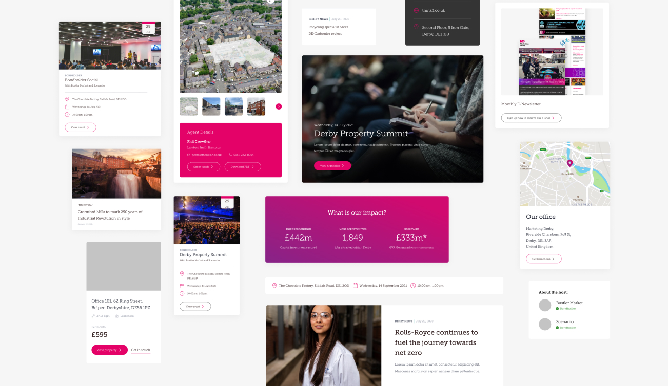
Additionally, the website was developed with scalability in mind. Creating and organising media & text blocks for behind the scenes of the website. So, the site can be easily maintained and expanded in the future, without compromising on quality and saving time.
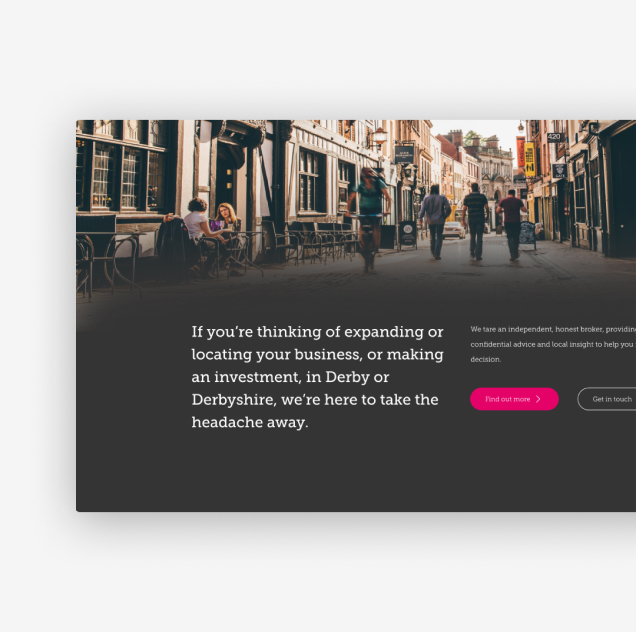

Employing Search Engines
To make website’s information easily accessible.
Considering the enormous amount of information there, including Derby business news, bondholders, investment properties, etc.
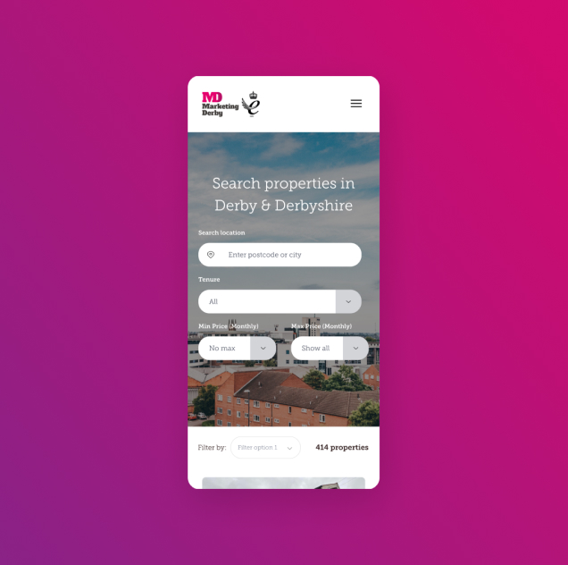
We created numerous search devices and organised the databases. Now anyone can use search fields instead of going through the website manually. This improves the user journey and makes it considerably
easier to navigate the website.
User journey & experience
A website built with the user in mind.
Organising the information, creating an easy-to-navigate sitemap, and adaptable website design. With all the information-heavy web pages having search fields.
We developed a user journey with the goal of making the website as accessible for investors & bondholders as possible. With easy-to-access pages that contain all the content needed to understand what Marketing Derby is and how to start working with them.
Additionally, we made sure that the website design is adaptable for not only desktop, but mobile and tablet platforms as well.

