Elton Ecology
An independent ecological consultancy.
The brief
Elton Ecology, an independent ecological consultancy, was looking for a brand & website design refresh – to modernise the look and future proof its visual identity.
The solution
Due to considerable progress over the years of operating, the old brand wasn’t sufficient anymore. It did not represent the business as it is today. The aim was to achieve longevity & adaptability through design – representing them not just as another local ecological consultancy but as an emerging player in the nationwide industry that you can’t ignore.
Services
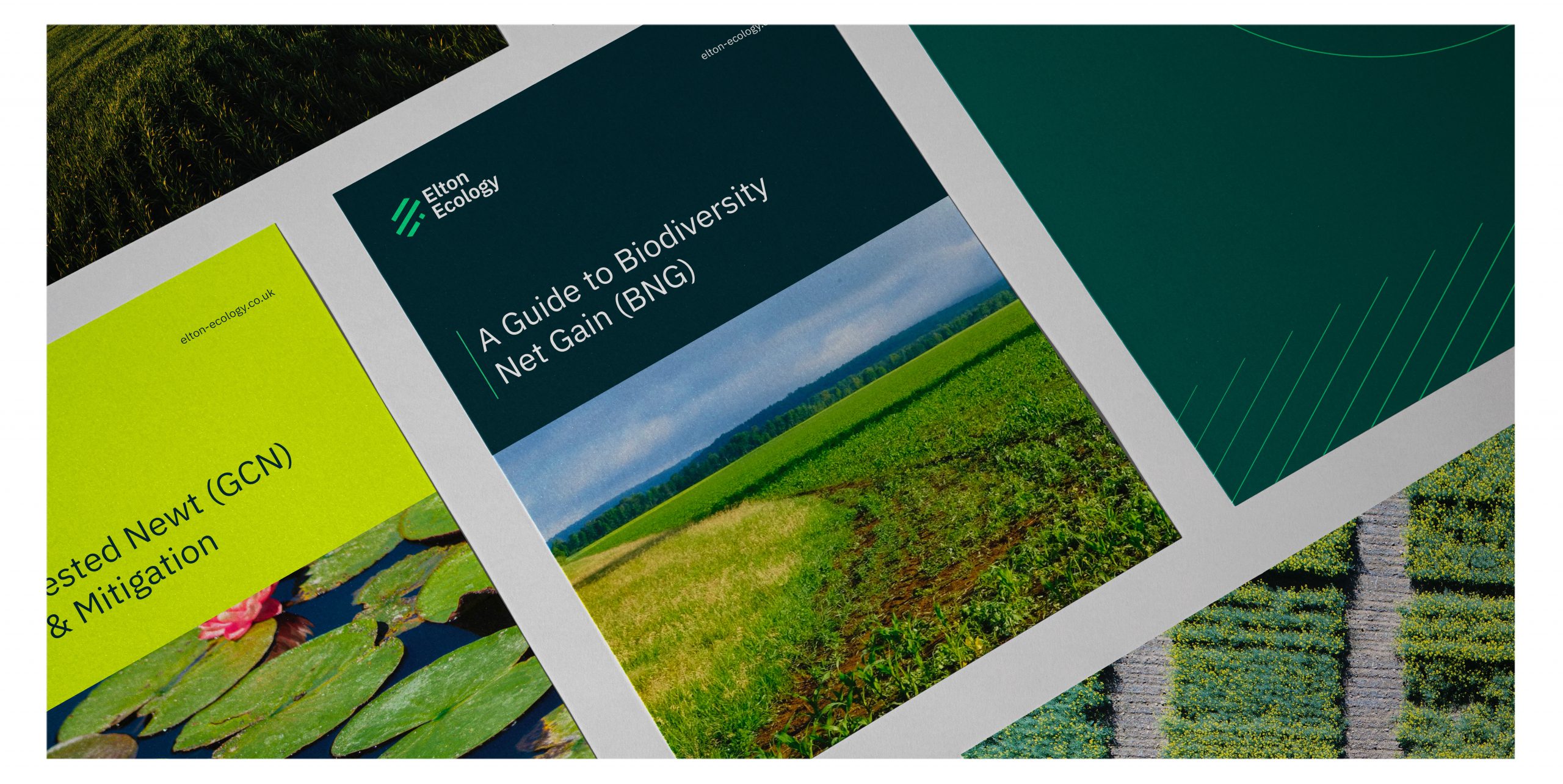
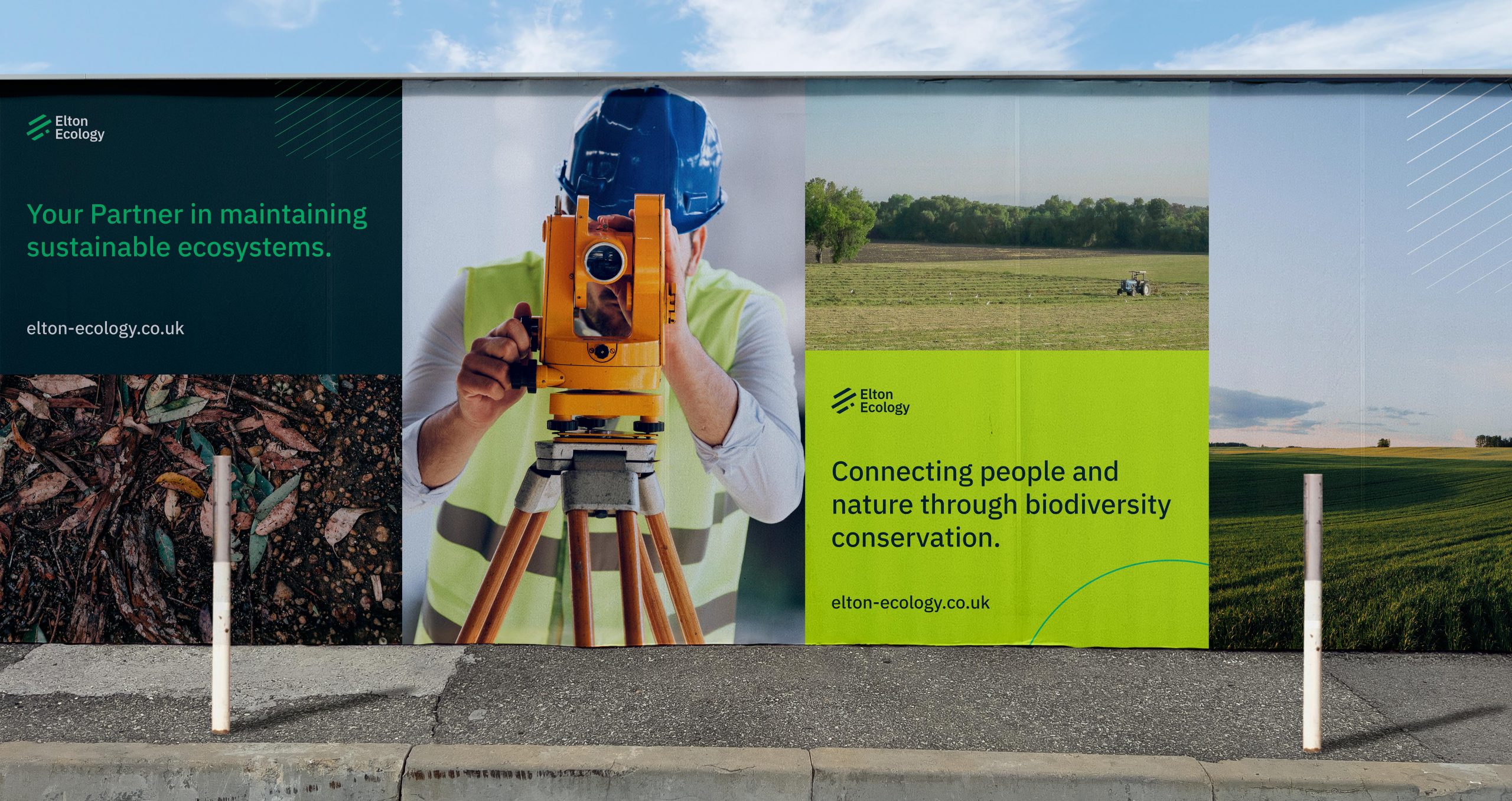
Turning a new leaf
The core of the brand refresh consisted of the logo and the new colour palette. Hugely inspired by the balance between urban & natural elements around us. The diagonal lines act as a brand device – representing the patterns found in nature and the forward direction Elton Ecology’s work has taken. The progress. The future.
Moving forward
The font itself is a modern Sans Serif – typography was meant to feel natural but without appearing as a soulless corporate conglomerate. Further design elements were extracted from the logo, to create a variety of design devices. Essentially, to facilitate the adaptability of the brand and unlock new mediums for creativity & marketing.