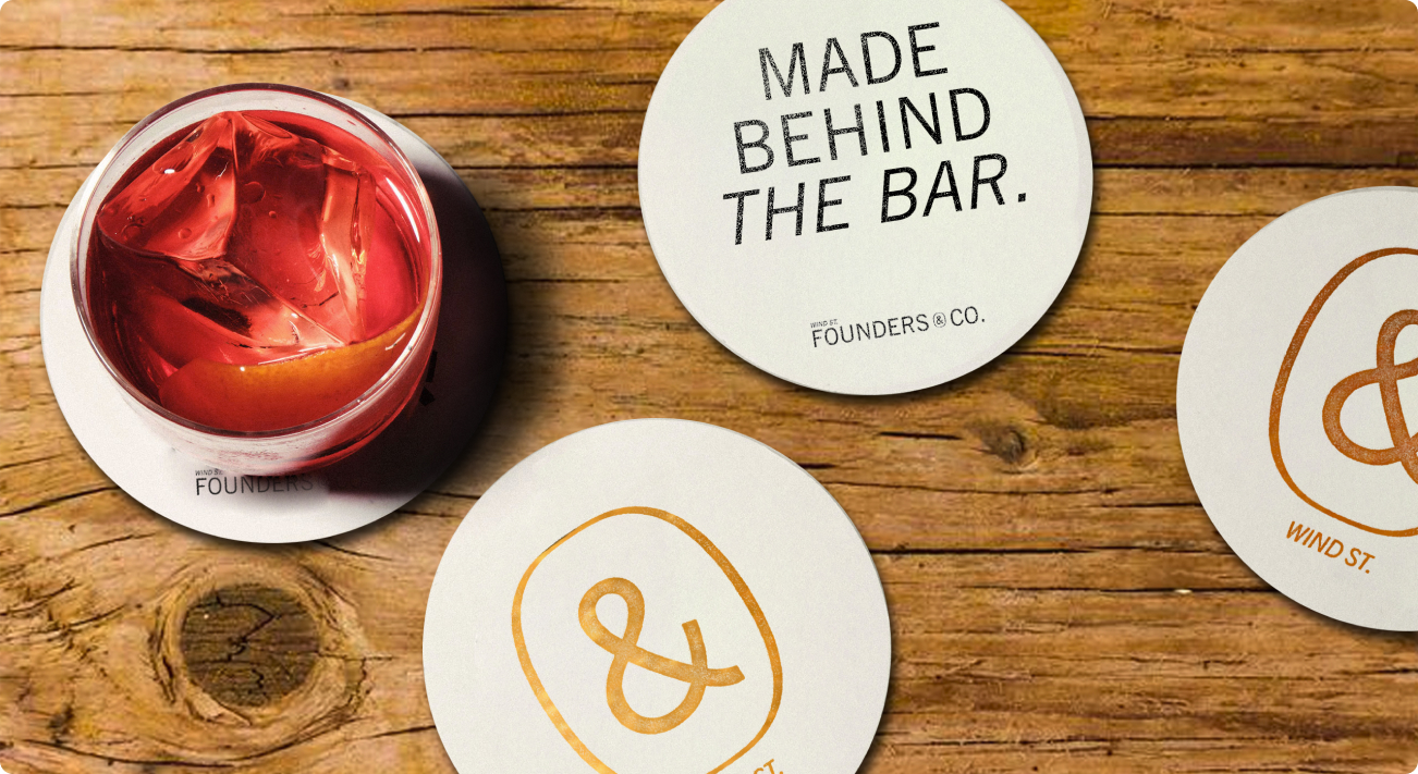
Founders & Co
Made in Swansea
The brief
We were approached by Revolution Bars Group UK for their brand-new project – Founders & Co. They were looking for agencies to develop and pitch branding concepts for their new location.
The brand they were looking for had to be inclusive, raw – a live
personification of the local community of Swansea.
We had to find the right way to not only develop the brand of the
franchise, but also make it flexible enough, so every future location could have a personalised representation of their history.
The brand had to have a way to highlight the uniqueness of every
location, but also scream ‘community’.
The solution
After a lot of debates and discussions we’ve ended up taking apart various concepts we prepared for the project and putting them back together as the current Founders & Co brand.
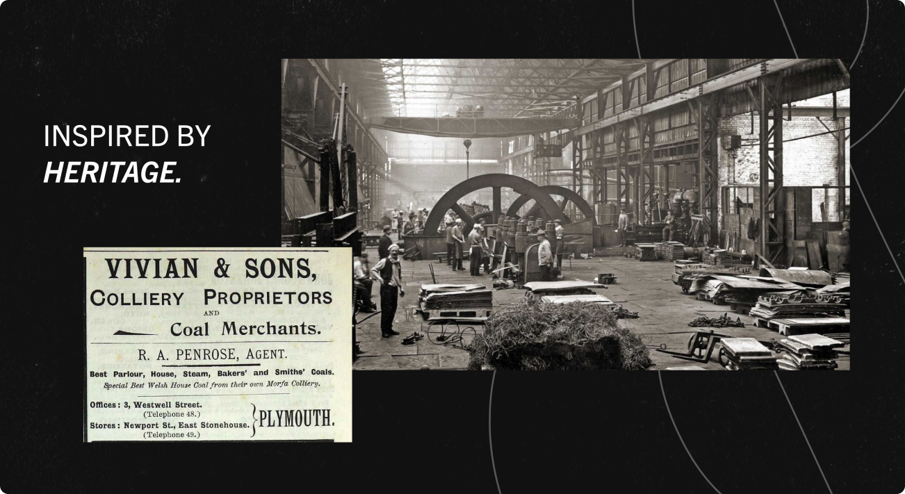
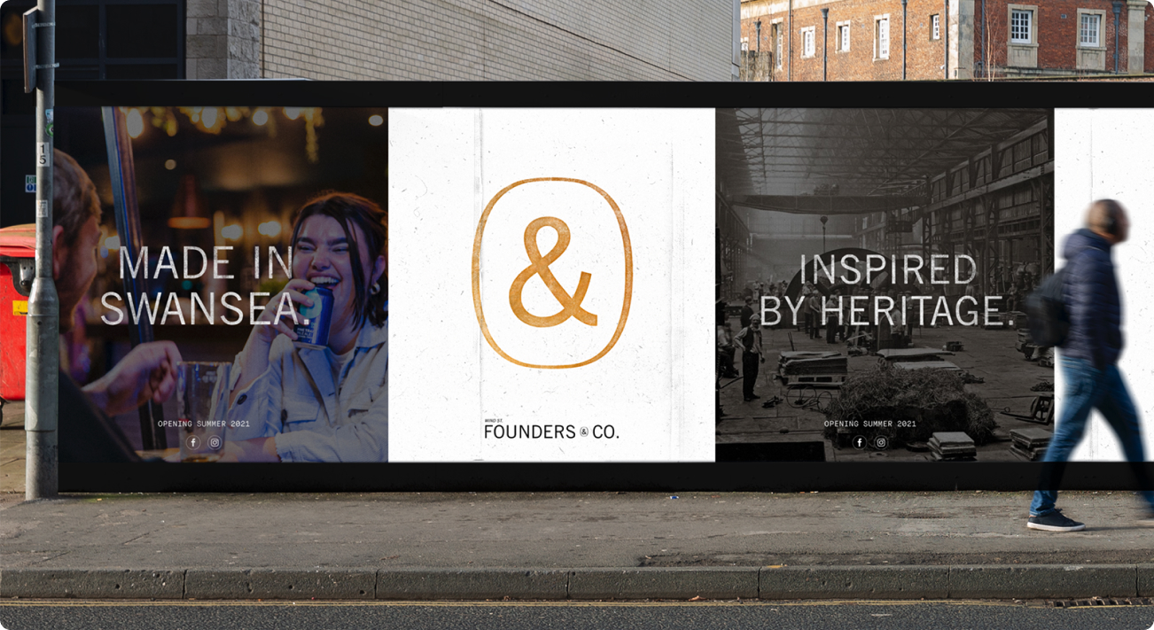
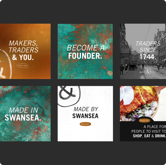
Our focus ended up being put on Swansea the city, Swansea the community, and their rich history of copper work. As well as the symbol ‘&’ – the hero of the story.
We’ve captured the rawness of the idea, by implementing copper motives around the brand – from fresh copper orange to patina colours.
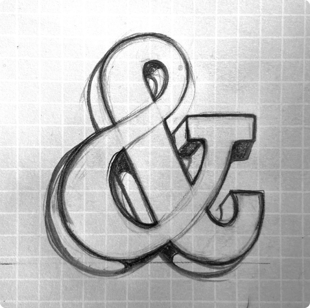
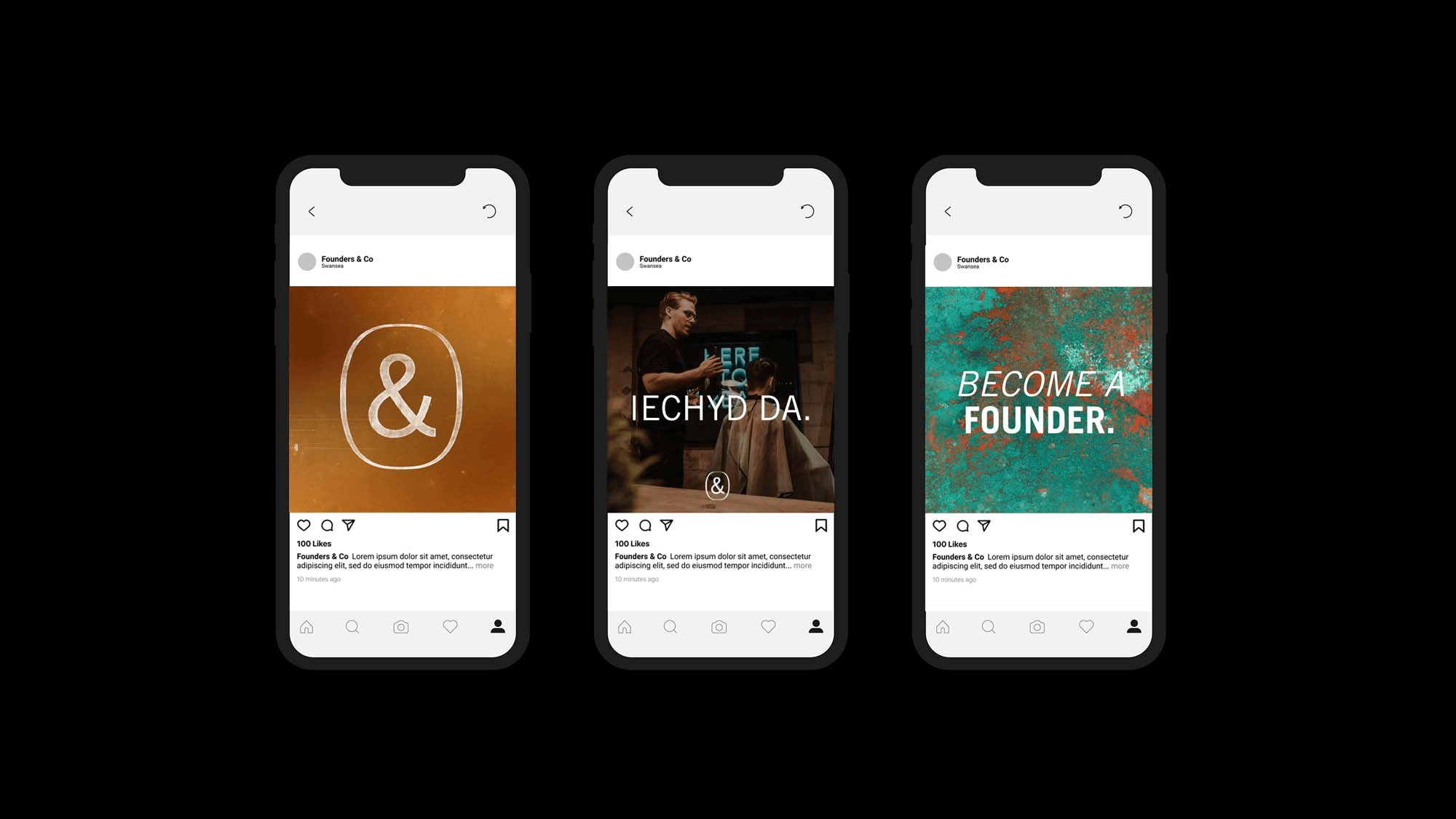
The logo is all about representing local community with the ‘&’ symbol, and who better to showcase the bread and butter of Swansea than a local graffiti artist – Hasan Kamil. He did an amazing job building up from the brand guidelines we’ve presented and really highlighted what makes Swansea.
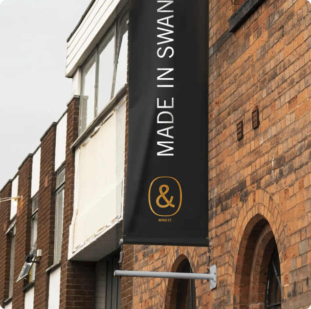
Made in Swansea
The makings of the city you want to visit.
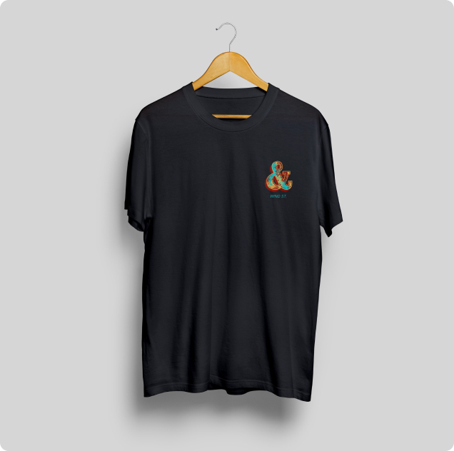
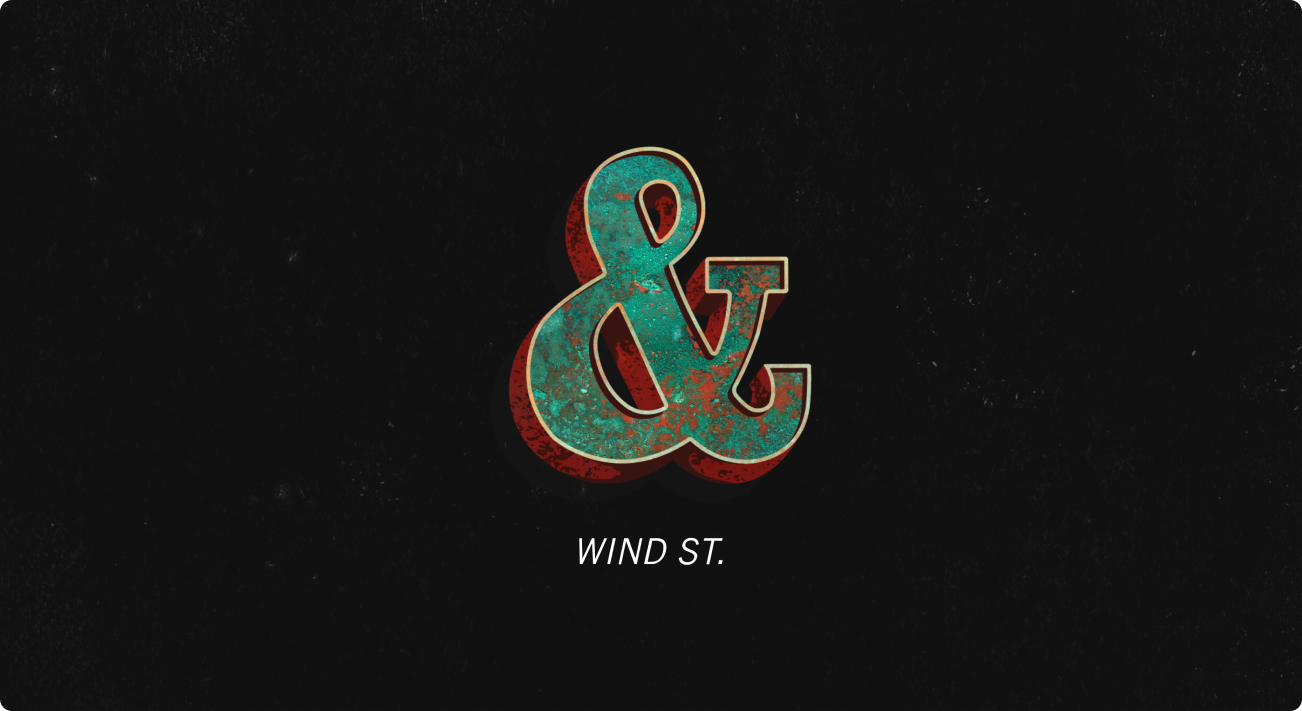
The branding was designed with the local site in mind. The location of the venue is featured just above the title. In this case it’s – Wind St. As well as the copper ‘&’.
We wanted to shout about Swansea heritage, so we’ve decided to shout about the rich copper history of the city. This can be seen online and in the location itself.
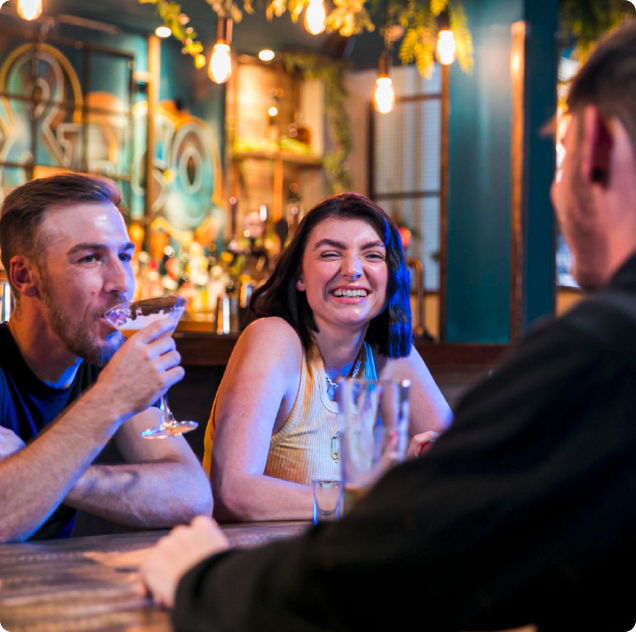
The venue was made with community in mind – Think, Drink, Laze, Graze, Browse. Activities for anyone and everyone from early mornings to late nights. You can go and have a drink or visit a yoga studio – everything made with inclusivity in mind.

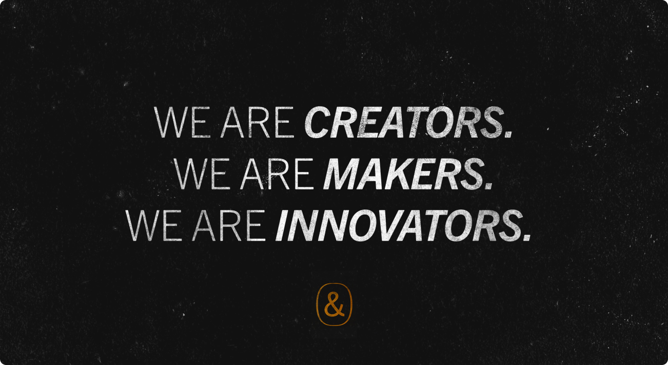

The hero of our story
The ampersand.
As mentioned above, the ampersand was the chosen symbol for the brand. Not only was it part of the local history, with most copper giants of the past were using it in their name, it was a part of the narrative.
& – is the hero of this story, the symbol, the artist, the community. It breathes and lives the location.
Hasan, the local artist, who created the logo took deep inspiration from writings on old machinery in abandoned copper factories and 19th century newspapers. The symbol had to embody the history of Swansea. Keeping in mind, that this venue was built as a starting point of the franchise, ampersand was made to be unique for every current and future location. It makes it exiting, it makes it familiar, it makes it unique, it
represents everything Founders & Co.