Love Chesterfield
The brief
An opportunity presented itself to us last year, to pitch a potential campaign to Chesterfield Borough Council. We dug in to our creative ‘war chest’ and prepared some broad ideas to present. They were looking to create a campaign, with an adaptable brand. The goal behind it was to invite people to come out of their homes, after the Covid-19 restrictions were lifted, to visit the Chesterfield High Street and start supporting local businesses!
Luckily our understanding of the project was on the same wavelengths as what Chesterfield Council was looking for and ended up selecting us for the job. Afterwards, we proceeded into the ‘research’ stage, which saw us exploring and understanding the essence of Chesterfield. We followed up on that by speaking with various focus groups – to determine what would suit the Chesterfield city the best. From college students to local business owners, we made sure to cover all our basis so we can start working on the final product.
The solution
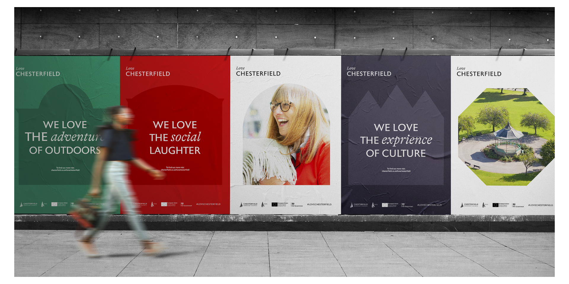
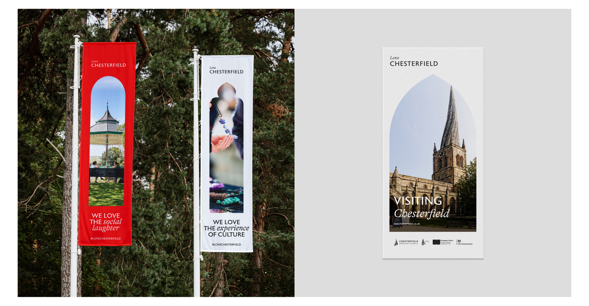
Our challenge was to create a brand that would present Chesterfield as THE hotspot to be in. A desirable place to visit and most importantly – a city that supports local businesses in the post-covid restrictions world. We chose typography and shapes of iconic Chesterfield buildings as the basis of the campaign brand.
The idea behind it was, that after being stuck inside for so long and only being able to see the ‘outside world’ through a window – you can now see those same windows in-person. Tying the end of Covid restrictions with an invitation back to the High Street.
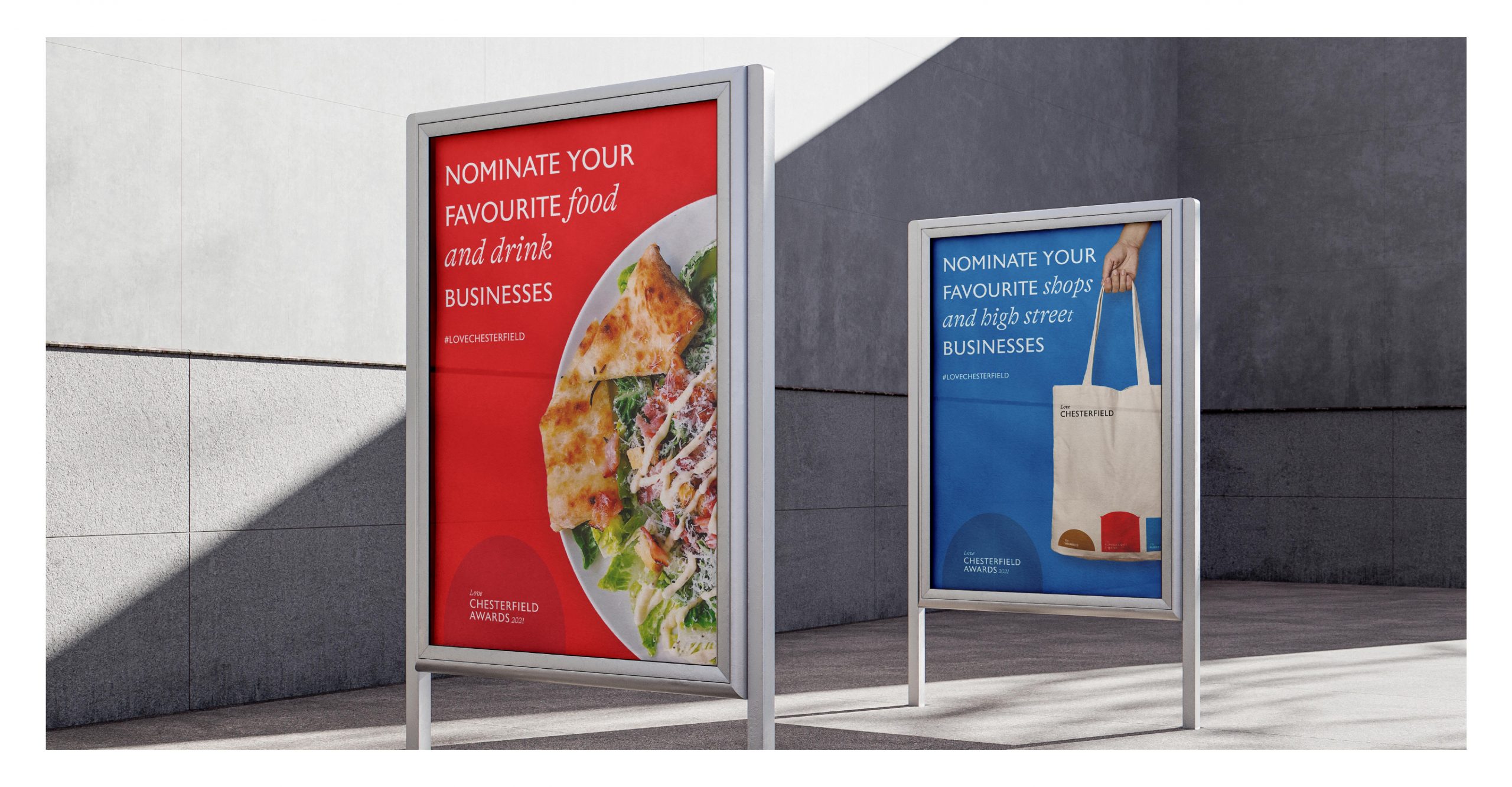
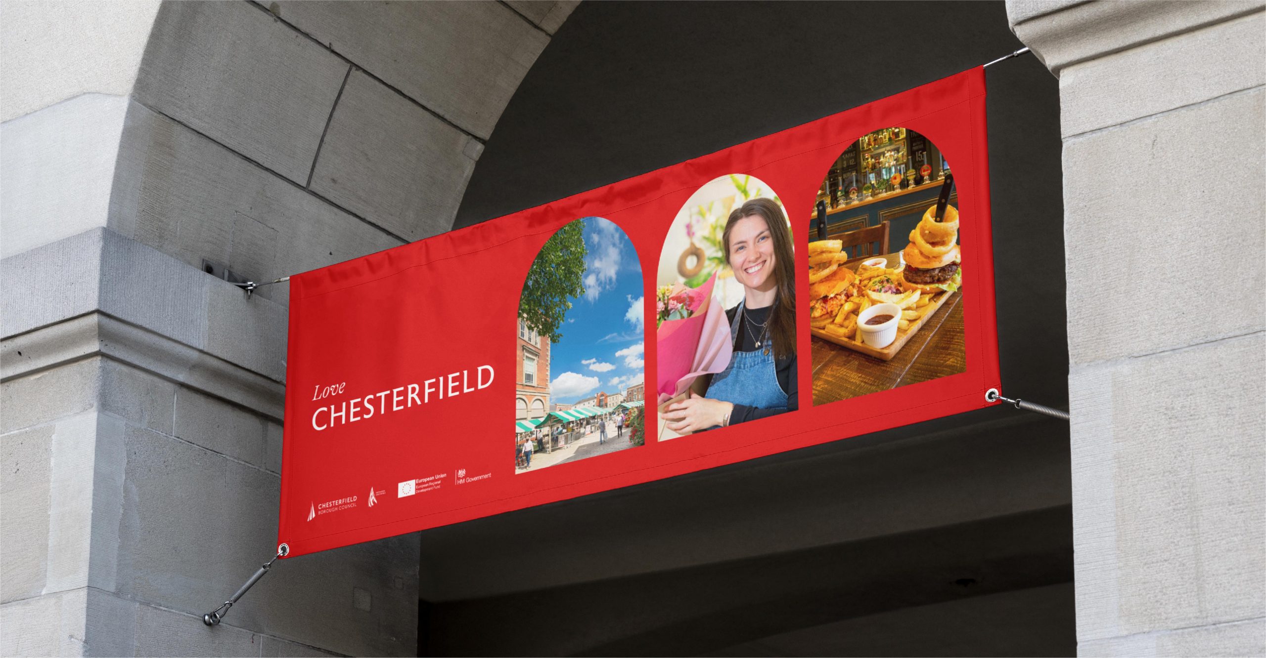
We also created media packs for local businesses, so they can get as involved in the ‘Love Chesterfield’ campaign. The true goal was always bringing people out of the isolation and involving local businesses brought that much needed feeling of belonging.
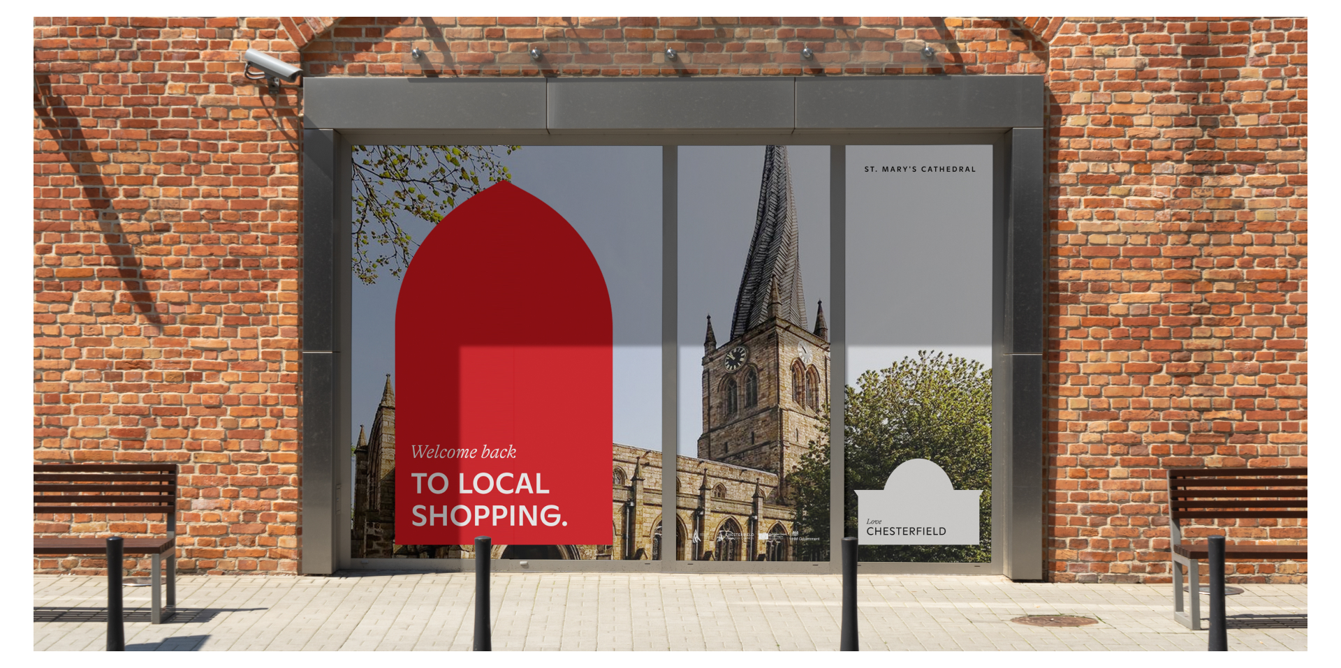
The Window
While working hand in hand with the council, we determined the most iconic places around the city and chose their windows as THE graphic device. We created a contemporary art direction that can be used in all levels of communication for the Love Chesterfield campaign.
The window symbol creates a sense of escapism and an opportunity to step into the ‘real’ Chesterfield. In the post-Covid environment we wanted to represent the mental escape people have been craving as they’ve been gazing through the windows – now they don’t need to limit themselves to just gazing.
Merging the Old with the New
One of our priorities was making sure to tie the branding elements to the Chesterfield Borough Council. We took the ‘Sans Serif’ font that was already in use by the Council and merged it with a new ‘Serif’ typeface. Not only did we use ‘Serif’ typography as a tool to highlight what’s important, but it also made the brand more familiar to the local community.
A town deep routed in the past but focused on the future.
Love Chesterfield Awards
In addition to the new brand, we created supporting materials for the Love Chesterfield Awards which was hosted on the 12th October 2022. Using a combination of the old ‘Sans Serif’ typography with the new ‘Serif’ typeface – it created a much-needed link between Chesterfield’s heritage and the 21st century.
Using the visuals and typography developed throughout the project, our team, with the help of Chesterfield Borough Council, picked out the most note-worthy features that resembled the city and built this within the marketing materials and merchandise.