What direction should your outdated brand take? – think3 examples
7th Aug 2024


Written by Benas Ruzgys
In the fast-paced business world, brands can quickly become outdated without owners even realising it. The first step in revitalising your brand is recognising the signs of obsolescence.
If you’ve noticed a decline in customer engagement, decreasing market share, or difficulty attracting younger demographics, these could be indicators that your brand has lost its relevance.
Other telltale signs include feeling out of place alongside competitors, struggling to adapt to new marketing channels, or receiving feedback that your brand feels “old-fashioned” or “behind the times.”
Acting on the Signs of an Outdated Brand
Evolutionary Change
One path forward is evolutionary change – gradually updating elements of your brand while maintaining core aspects that still resonate with your audience.
This approach can help you modernise without alienating loyal customers. It might involve subtle logo updates, refreshing your colour palette, or adjusting your messaging to better align with current values and trends.
Rebranding
You might opt for a more drastic approach – if your brand has significantly fallen behind or if you’re targeting a completely different market segment.
This could mean a comprehensive rebranding effort – potentially changing your name, completely overhauling your visual identity, or pivoting your brand positioning.
While more risky, this approach can signal a dramatic shift and potentially capture new market opportunities.
Creating a Sub-Brand
Another option is to create a sub-brand or spin-off that targets a specific segment or trend – allowing you to maintain your primary brand while exploring new directions.
This strategy can be particularly effective if different parts of your customer base have diverging needs or preferences.
think3 – examples of what you can achieve
Rebranding & brand evolution are common strategies for outdated companies to modernise their image and stay relevant. In think3 case – most of our case studies focus on successful brand refreshes.
And most brands going through this choose to tackle the website project at once. While these updates affect various aspects of a brand’s identity – they’re often most noticeable through a new website.
As the primary digital touchpoint for many customers, websites serve as the ideal showcase for a refreshed brand, featuring updated design, improved functionality, and refined messaging that reflect the company’s evolution.
East Midlands Chamber
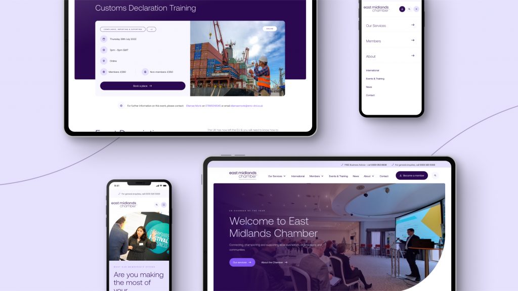
The East Midlands Chamber, serving over 4,000 members, underwent a comprehensive brand and website overhaul as part of their digital transformation initiative.
The project aimed to enhance user experience, solidify the Chamber’s identity, and integrate seamlessly with their CRM. The rebranding effort focused on creating a professional, modern, and adaptable brand while retaining the Chamber’s heritage.
A new website was developed with a scalable design system, intuitive navigation, and real-time data synchronisation with the CRM.
This extensive refresh was undertaken to strengthen the Chamber’s position as the foremost business representation body in the East Midlands. By modernising their visual identity and digital presence, the Chamber can now more effectively serve its diverse membership base and attract new members.
The integration of sub-brands and the creation of a cohesive design system ensure consistency across all touchpoints – reinforcing the Chamber’s authority and professionalism.
The improved website functionality and CRM integration enhance operational efficiency and member engagement – ultimately providing a more valuable and seamless experience for all stakeholders.
This comprehensive update positions the East Midlands Chamber as a forward-thinking, user-centric organisation ready to meet the evolving needs of its business community.
Scargill Mann & Co
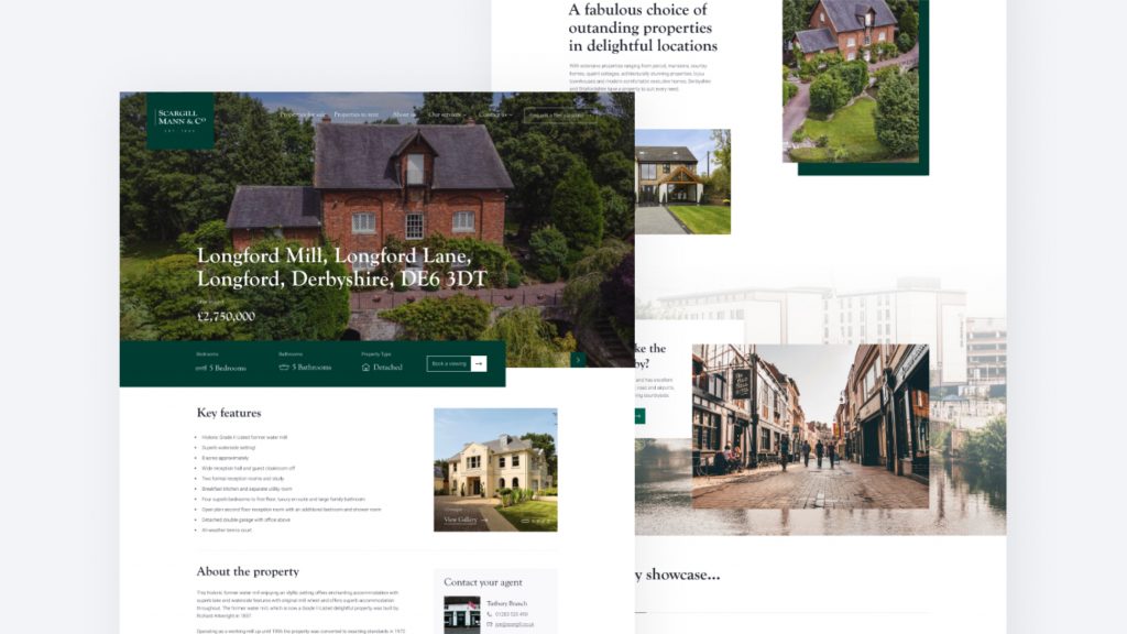
Scargill Mann & Co, a well-established estate agent in Derbyshire and East Staffordshire, partnered with think3 to update their branding and develop a new website – that would modernise their digital presence while maintaining their reputation for excellent customer service.
The project aimed to evolve the brand subtly and create a user-friendly website that catered to both existing and new customers. The process involved a careful brand evolution – retaining the company’s core values and local reputation while updating the colour palette and refining the logo.
The website redesign focused on creating a seamless user experience, integrating with third-party systems like Rightmove to provide up-to-date property listings.
A key feature was the implementation of a simple, three-stage valuation request form designed to minimise user abandonment. The property search functionality was developed to mirror familiar interfaces, ensuring ease of use for potential buyers.
This project successfully modernised Scargill Mann & Co’s online presence while preserving their established brand identity – positioning them to better serve their customers in the digital age and maintain their competitive edge in the local property market.
Elton Ecology
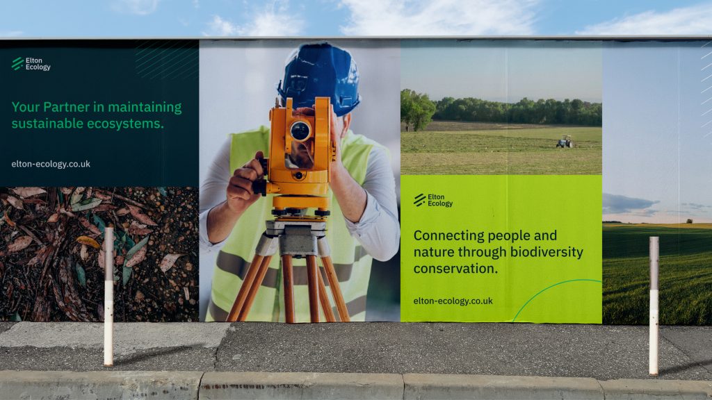
Elton Ecology, an independent ecological consultancy, embarked on a brand and website design refresh project to modernise their visual identity and better reflect their growth and evolving position in the industry.
The goal was to transition from a local consultancy image to that of a significant nationwide player, while ensuring the new brand would be adaptable and enduring.
The brand refresh centred on a new logo and colour palette – drawing inspiration from the balance between urban and natural elements.
Key features included diagonal lines representing natural patterns & forward progress and a modern sans-serif font that conveyed professionalism without appearing overly corporate or impersonal.
The redesign successfully transformed Elton Ecology’s image to align with their expanded scope and ambitions – creating a versatile brand identity that can adapt to various marketing mediums.
This refresh positions Elton Ecology as a forward-thinking, nationwide ecological consultancy – ready to make a significant impact in their field while maintaining a connection to their core values.
Marketing Derby
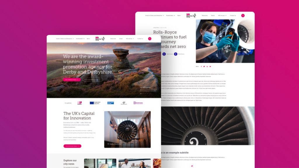
Marketing Derby, an investment and promotion agency focused on attracting businesses to Derby, commissioned a brand refresh & a new website to better showcase the city’s opportunities and support their networking initiatives.
The project aimed to create a bespoke, user-friendly platform that would effectively highlight investment prospects and bondholder opportunities – positioning Derby as an attractive destination for business.
The development process began with careful planning, including sitemap creation and content strategy, culminating in a high-fidelity wireframe. The final website features advanced search capabilities, automated property updates via API integration, and a scalable design system for easy future expansion.
Key focus areas included improving navigation, organising vast amounts of information effectively, and ensuring accessibility across all devices.
This comprehensive overhaul resulted in a website that not only streamlines the user journey for potential investors and bondholders but also reinforces the Marketing Derby brand’s role as a pivotal facilitator of the city’s economic growth.
The new site serves as a powerful tool in Marketing Derby’s mission to promote Derby as ‘the place to be’ for business and investment.
Eclipse Automotive Technology
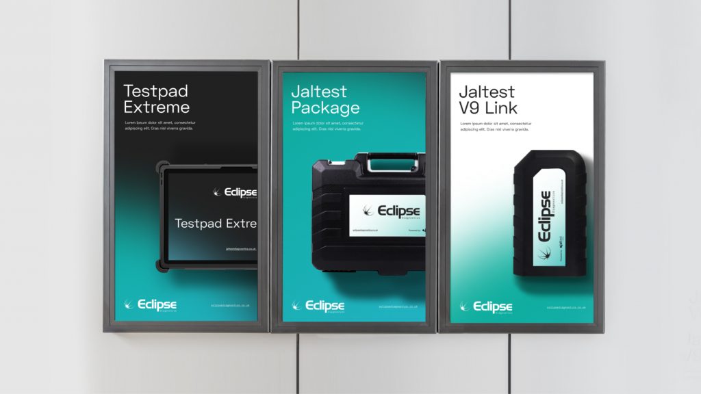
Eclipse Automotive Technology, the UK’s leading supplier of diagnostics tools for commercial fleets, underwent a significant brand evolution to strengthen its market position.
This project focused on creating a bold new identity that would set Eclipse apart from competitors and reflect its advanced technological offerings.
The rebranding effort included – developing a new visual language, colour palette, typography, and overall brand strategy that captured the essence of Eclipse’s innovative products while highlighting the human element behind the technology.
The project’s success lay in its ability to help Eclipse adapt to changing market demands and become more relevant in a competitive sector. By creating a dynamic and visually striking brand identity inspired by the concept of an eclipse, the company was able to convey its technological prowess while maintaining a sense of approachability.
The new website design, developed through collaborative workshops and interactive prototypes, further enhanced Eclipse’s digital presence, offering a user experience that stood out from the corporate-styled pages of competitors.
This comprehensive brand refresh positioned Eclipse as a forward-thinking market leader, ready to meet the evolving needs of its customers in the automotive diagnostics industry.
Staying True to Your Core
Regardless of the direction you choose, the key is to stay true to your core values while adapting to the changing landscape.
Your brand should evolve in a way that feels authentic and resonates with both existing and potential customers. Remember, the goal isn’t just to appear modern, but to genuinely meet the current and future needs of your target audience.
And of course – if you’re in need of support, feel free to get in touch with us here at think3.